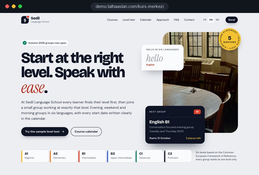
A course website carries a structure that is rewritten every term: groups open and fill, tutors change, levels shift. A static business site falls behind at that pace, and the moment a learner sees an outdated start date, they pick up the phone or move on to another school.
This guide walks through the decisions you make, in order, when planning a site for a language school, a music or art school or a tutoring center. Each section gives you a criterion or a checklist you can apply directly.
01Build the sitemap from a program inventory
The structure of a course website comes from a program inventory prepared before any design work. That inventory decides which programs get their own page, which stay as a section of a parent page and which fields the calendar needs.
Build the inventory in this order:
- List every program in one table: language, instrument, studio class or exam preparation group.
- Add the levels and age group next to each program; adult English and English for children are separate rows.
- Mark the format: group class in person, private lesson or online class.
- Note how often each program starts a new group; a summer workshop that runs once a year may need a seasonal announcement rather than a permanent page.
- For each row, write down how people search for it, such as "adult Spanish classes for beginners" or "Saturday guitar lessons".
A practical rule for separate pages: a program gets its own page when people search for it on its own and when it differs enough to carry its own content. Spanish A1 and A2 can live on one page as level sections; an English conversation club and IELTS preparation need separate pages, because the learner, length and expectations differ.
This table later feeds the calendar, the options in the enrollment form and the measurement report. An empty cell in it is a question the learner will not find answered on the site.
02What a program page has to answer
A program page does its job when it answers, on the page, every question that would otherwise lead to a call or a message. Brochure copy does not do that.
Every program page should include:
- Who it is for: Age, goal and starting level, and also who it does not suit, for example why a conversation club is too early for someone with no English at all.
- Lesson pattern: Days per week, lesson length, how many weeks a level takes and the maximum group size.
- Materials: Whether books, instruments or supplies are provided or bought by the learner.
- End of level: What learners should be able to do by the end, written as a description of content rather than a promise of results.
- Questions: Three to five questions specific to that program, such as "what happens if I miss a lesson".
The top of the page should show the next group for that program and the enroll button. The lower part links to the tutor profile and the placement test.
Write in the learner's words. "Most of the lesson is spent speaking" says more than "communicative approach". We cover how program pages work in search in our SEO service.
03Treat the course calendar as data, not a poster
The course calendar should be a data structure in which every group is a separate record. A calendar uploaded as an image or PDF can be neither searched nor shown on the relevant program pages.
Each group record needs these fields:
- Program and level, so the group appears automatically on the right program page.
- Start date, lesson days and times, written plainly, such as "Tuesday and Thursday, 7 to 9 pm".
- Tutor, format (in person or online) and room.
- Places: open, last few places, full; when a group is full, the enroll button turns into a waiting list.
- Status: enrolling, started, finished; finished groups leave the list on their own.
The most common calendar problem is past dates. A group that started in September and still shows as "coming soon" in November makes the whole site look neglected. Set a rule that moves a group to "started" once its start date passes and archives it after a set period.
Decide early who will update the calendar. If the person at the front desk does not touch the site when opening a group, the calendar is outdated within a month; the admin panel has to be simple enough to use while taking an enrollment on the phone.
04Design the placement test as a placement tool
An online placement test is not an exam; it is a tool that sends learners to the right group. Its purpose is to start the enrollment with the right class rather than to give a precise grade, and a test designed with that aim stays short and gets finished.
Build the test in these steps:
- Pick a few questions that separate each level from the next; a short, discriminating set works, a bank of hundreds is not needed.
- Order the questions from easy to hard and check yourself that the test can be finished on a phone in a few minutes.
- Show the result as a level and a suggested group, not a score: "Starting in a B1 group looks right for you; the next one begins on this date."
- Move the learner from the result screen to the enrollment form in one tap, with the result added to the form automatically.
- For borderline results, offer a "request a level chat" option.
Skills such as speaking, ear and rhythm in music, or hand skills in art only show in a trial lesson. For these courses a trial lesson request is the more honest route; if learners should choose the day and time themselves, a website with online booking fits that need.
Your teaching team writes the questions; we build how they appear on screen, how the result is calculated and how it passes into the enrollment.
05What belongs in a tutor profile
A tutor profile should let the learner understand who will teach them and whether that person fits their level. People choosing private music lessons or a small language group often decide largely on the tutor.
A useful tutor profile includes:
- Subjects and levels: Which programs, which levels and which age groups the tutor teaches.
- Training and experience: Degree, certificates and years of teaching; titles that cannot be documented stay off the page.
- Teaching style: Two or three sentences on how lessons run, in the tutor's own words.
- Open groups: The tutor's groups currently taking enrollments, pulled automatically from the calendar.
Plan what happens when a tutor leaves. Deleting the profile breaks the groups and program page links attached to it; instead, build a panel action that deactivates the profile and hands its groups to the new tutor.
Photos and a short video build trust, but each tutor should give written permission and approve the published details. Use one template for every profile, so no tutor gets three lines while another gets two screens.
06The enrollment form and the first follow up
The enrollment form should be short; the real work starts in the hours after it is sent. The learner needs to know the request arrived, and your team needs to see who to call and when.
Ask only for what the first conversation needs:
- Name, phone and email; date of birth, home address and payment details wait for the confirmed enrollment.
- Program, level and group; if the learner came from the calendar, the group is already selected.
- The placement test result, added automatically when there is one.
- For children, a field confirming that a parent is filling in the form, and the child's age.
- Preferred reply channel: phone call, WhatsApp or email.
A link to your privacy notice belongs next to the form. If you want to send marketing messages, add a separate checkbox for that, unticked by default.
After submission, tell the learner on screen and by email what happens next: which group they applied for, when they will be contacted and what the confirmed enrollment requires. On your side, form, WhatsApp and phone requests should land in one list with their source and status.
07Terms, cancellation and images of learners
When learners sign up and pay online, the rules on consumer contracts and personal data shape three parts of the site: the terms page, the checkout and the gallery.
The points to plan for:
- Cancellation in the UK: Under the Consumer Contracts Regulations, the cancellation period for a service contract made at a distance ends 14 days after the contract is entered into. Show this information, with your refund policy, before the learner pays and again in the confirmation email.
- Course terms: Missed lessons, transfers between groups and what happens if a group does not reach its minimum size should be on a permanent terms page linked from every enrollment form.
- Learner images: Learners, and parents for children, should agree before a photo or name goes online; keep a record of that consent and plan the gallery around it.
Instead of named success stories, show the course itself: the room, the materials, the tutor and how progress is checked.
The wording of your terms is yours to approve with your adviser; before launch, we flag anything on the site that looks doubtful.
08When parents make the decision
For children and teenagers the parent decides, so a tutoring center, a children's language course or a music school needs the parent's information in its own visible place.
On the parent's side, these points matter:
- Weekly routine: Lesson times relative to the school day, whether there is pick up, and where children wait between lessons.
- Progress: For tutoring and exam preparation, the mock exam schedule and how results are shared with parents.
- Communication: Which channel parents use for absences, lesson changes and announcements.
- Age fit: The minimum age for each program and how age groups are split.
In tutoring, students join the research, but parents usually submit the enrollment. Program pages organized by year group should therefore carry the subject content the student wants to see and the weekly plan the parent wants to see on the same page, in separate sections.
Parents have one more question: how their child's data is protected. Ask only for what is necessary about the child; if health information or emergency contacts are needed, collect them at the confirmed enrollment stage, not in the website form.
09Mobile speed and a calendar that reads on a phone
Most visitors to a course website arrive on a phone, so program pages and the calendar should be designed for a small screen first, with the desktop layout derived from that. A wide calendar table that looks neat on a laptop turns into a sideways scrolling strip nobody reads on a phone.
Use these criteria for mobile:
- Each group appears as a card: program, level, day and time, places left and the enroll button.
- Cards can be filtered by program, level and day type; someone who picks "weekend" sees weekend groups only.
- Call and WhatsApp buttons stay fixed at the bottom of the screen without covering content.
- Brochures and syllabi appear as text on the page, not as PDF downloads.
Measure speed against Google's Core Web Vitals thresholds. LCP, the time until the largest element on the page loads, should be 2.5 seconds or less; INP, the delay before the page responds to a tap, 200 milliseconds or less; CLS, how much the layout shifts while loading, 0.1 or less. Google counts a page as good when these values are met for 75 percent of visits.
Classroom photos and promo videos are the usual cause of slow course pages. Resize images for the screen and load videos only when tapped. A mobile friendly test shows in a few minutes how your current site behaves on a phone.
10Showing up in local and program searches
People looking for a course usually compare options near them, so program pages, the contact page and the Google Business Profile should work as three parts that support each other. The same details should appear in the same form in all three.
Follow these steps for local visibility:
- Use your real world name in the Google Business Profile; Google's guidelines do not allow keywords such as "Spanish Classes" added to the business name.
- Choose the primary category for your main activity and use additional categories for other programs.
- Write your address, phone number and opening hours exactly as they appear on your contact page.
- Add directions, parking and public transport details to the contact page; for parents, this often affects the decision.
- Ask learners for a Google review at the end of each term and reply briefly, without personal details.
Program pages support local searches too. For someone searching "Saturday guitar lessons", the right page is the guitar program page; when it shows the neighborhood, directions and a map, search engines and learners receive the same signal.
11Start of term campaigns and ad landing pages
A course provider's advertising follows the terms, and each campaign should lead to a page about one program and its upcoming groups, not to the home page. Someone who clicks an ad for "September evening English groups" gets lost on a home page that lists every course.
A campaign page works well with this layout: program and term in the headline, upcoming groups below it, a short link to the placement test, a tutor introduction and a single enrollment form. A single goal landing page like this goes live without touching the main menu and can be taken down when the term starts.
If you run Google Ads, know that Quality Score has three components: expected click through rate, ad relevance and landing page experience. Google describes it as a diagnostic tool, not a direct input in the ad auction; still, an ad and a page that talk about the same program help all three. We set up campaign structure as part of our Google Ads management.
Print promotion should be measurable as well:
- Point QR codes on posters and flyers to a link that identifies the source.
- Use a separate campaign tag for each poster location or distribution; a UTM builder is enough for this.
- Tag the link in your Instagram profile so enrollments from social media show up separately.
- When a campaign ends, archive the page or redirect it to the next term; a page with past dates misleads learners.
12Measuring which program brings enrollments
The point of measurement is not counting visits; it is seeing which program, channel and campaign brings enrollment requests, and how many of them turn into confirmed enrollments. That is why measurement has to be set up before launch.
Set it up in this order:
- Define conversions: enrollment form sent, placement test finished, call button and WhatsApp clicks.
- Attach program and group details to each conversion, so the report reads at the level of "English B1 evening group".
- Set up cookie consent; for visitors in the EU and UK, non essential tracking should run only after consent, and Google requires consent mode for users in the European Economic Area.
- Keep a status on every request in the enrollment list: contacted, level chat done, enrolled, dropped.
- At the end of term, match confirmed enrollments with their sources to see which channel really brought learners.
Step four is the one most often skipped, and it leaves the report incomplete. If an ad brings many forms and no confirmed enrollments, the problem may lie in level matching or response time rather than in the ad; you can only see that when statuses are kept.
Review the results with the calendar every term: a time slot with no requests or a level with a waiting list is concrete input for planning the next one.
13Common mistakes on course websites
Most mistakes on course websites come not from design but from never thinking through how the site will live during a term. These are the ones we see most, with what to do instead:
- Uploading the calendar as an image: A poster image cannot be searched or updated; enter each group as a separate record in the admin panel.
- Leaving level names unexplained: "Elementary" or "Level 3" tells a learner little; next to each level, add one sentence on what people at that level can do.
- Promoting with named success stories: Names and photos without recorded consent create risk; promote through the program, the tutors and how progress is checked.
- Hiding the terms: Cancellation and refund details tucked into the footer invite disputes; show them before payment and link them from every form.
- Making the form long: An enrollment form asking for address and date of birth gets abandoned; leave those for the confirmed enrollment.
- Sending every ad to the home page: Link each campaign to its program or term page and tag the source.
The common fix is to plan the site together with the term calendar. Before launch, walk through a whole term on paper: a group opens, fills, starts and finishes. At each step, note what changes on the site and who changes it.
14Choosing a partner and the next step
When choosing a team for a course website, look less at design samples and more at whether they can explain how the calendar, test and enrollment will work and how the site will live through a term. Ask these questions:
- Can we update the calendar and groups ourselves from the admin panel, and what happens when a group is full?
- How will the placement test result reach us together with the enrollment?
- How will terms, cancellation information and learner consent be handled in the design?
- Which report will show us which program and which ad brought enrollments?
- In whose name will the site, the domain and the content be registered?
We do not have a live client project in this field yet, so we show our approach on the live demo site linked on this page. You can see our work in other sectors among our references.
To decide, you need three things ready: the program inventory, the term calendar and who will handle incoming enrollments. Once you have them, get in touch with us, and we will define the scope together and prepare a written quote. Fixed price packages and what they include are listed under web design pricing. If the site has to be ready before a term starts, mention it in the first call so we can plan the work backwards from that date.