A membership website is not a place where content gets published once; it is a service your members decide to buy again every billing cycle. Each renewal date is a quiet vote on whether the site, the content and the experience are still worth it. That is why most key decisions are made before design starts.
This guide follows the questions an owner meets in order: whether the model fits at all, how to structure plans, what the public pages must show, then login, billing, cancellation, content protection, search, measurement and running the site after launch. Every section ends in something you can check, ask or do with your team this week.
01Do you actually need a membership model
Membership only makes sense if you can keep producing new value; putting a one time product behind a subscription mostly prepares you to lose members in month two. The first question is about content, not technology: why would someone still be paying in month three?
Answer these four tests honestly. If you answer "no" to more than two, a one time sale or a straightforward business website is usually the better starting point.
- Continuity: do you have the material and the calendar to publish several new lessons, reports or updates every month for the next six months.
- Exclusivity: is your content already available in free videos or blogs, or does your interpretation, structure and feedback make the difference.
- Audience: is there a real group of people who already follow you, write to you or pay you for courses or advice; a site does not create demand from nothing.
- Time: can you name one person who will handle member questions, refund requests and technical issues every week.
Even when the tests come out positive, keep the first version narrow. Launching with one programme or one content series and adding plans after you see how members behave is far less risky than building five tiers up front and carrying the empty ones.
02Map content to plans before any design work
The document that drives the menu, the access rules and the pricing page of a membership site is a content and plan map. Projects that start without it end up debating the same question every week: which plan does this video belong to?
We suggest building the map in a spreadsheet, in this order:
- List every piece of content you have and will produce in the next six months, one per row: lesson, video, PDF, live session recording, template, announcement.
- Add the content type, length and topic to each row, and group related items into modules or series.
- Create columns for "public", "free member" and each paid plan, and mark which ones every row belongs to; one item can sit in several plans.
- For drip content, note how many days after a member joins each item should open.
- Count the rows per plan; a plan with very little content should be merged or dropped.
The spreadsheet then becomes the source of the access rules in the software. When an editor adds new content, the only job is to tick the matching plans in the dashboard, so "who sees what" depends on a rule rather than on someone's memory.
03Choosing plan count, billing period and trials
Your plans are the product, and fewer plans make the decision easier. Two or three tiers are enough for most membership sites; beyond that, the comparison table stops being readable.
Separate plans by a real difference in what members need, not by slicing the same lessons into bigger and smaller piles. For a language teacher, "recorded lessons" versus "recorded lessons plus a monthly live Q&A" is easy to understand; plans that differ only in the number of videos confuse people. These questions help:
- Billing period: is the content a programme with an end point or an ongoing stream; annual plans suit programmes, monthly plans suit continuous publishing.
- Trial or preview: a free trial that starts with card details needs very clear renewal and cancellation wording; a free preview avoids that question.
- Free tier: a registered but unpaid level builds an email list and makes the later upgrade easier.
- Team sales: will companies want seats for several employees; this changes the account structure and must be known on day one.
Before you put prices next to plan names, decide which plan carries the "recommended" label. Showing visitors one sensible path works better than three options that look equal. If you offer annual billing, state the saving as an amount, so nobody has to do the math.
04Public pages sell membership, locked content keeps it
Everything a visitor sees before joining is a sales page, so the public layer deserves as much care as the members area. Before clicking the sign up button, people want three answers: what will I learn or get, who is behind it, and is it right for me?
A strong public layer includes:
- A concrete syllabus: module titles, number of lessons and the length of each, instead of phrases like "comprehensive content".
- The expert: who created the material, their background, and why they teach this topic; a short intro video helps.
- A real preview: the first lesson, the opening pages of a report or a sample template, viewable without registering.
- Who it is not for: an advanced programme should say plainly that beginners will struggle; the wrong member means an early cancellation.
- The terms: how renewal works, that cancellation happens in the account, and the refund rule, all visible before checkout.
When you choose the preview, open one of your strongest pieces, not the shortest or weakest. Visitors want to see quality before paying, and the preview is the only content that persuades on your behalf.
05Member login and sign up: few steps, solid security
The registration form is the first point of friction in any membership system, and every extra field costs you sign ups. Name, email and password are enough to register; billing details belong in checkout and profile details can wait until after joining.
On security, the basics are clear. Following OWASP guidance, passwords should be stored with slow hashing algorithms such as Argon2id or bcrypt and never in plain text, and reset links should be short lived and single use. A password strength meter on the form is a small detail that helps members choose better passwords.
The issue most often overlooked in the member login experience is whether verification and reset emails reach the inbox. If they land in spam, members cannot finish registering and write to your support instead. Check these before launch:
- Are SPF, DKIM and DMARC records set correctly for your sending domain; a SPF, DKIM and DMARC checker shows this in a few minutes.
- Do system emails go out through a sending service separate from your marketing newsletter.
- Does sign in with Google suit your audience; for corporate members, registration with a work address can be easier to manage.
- Are failed login attempts rate limited, and are members notified about suspicious sign ins.
06Recurring billing and the failed renewal scenario
Recurring billing is the revenue engine of a membership site, and it is usually the task that starts too late. Stored cards and recurring charges need approval from your payment provider; starting that application alongside the design keeps payments from delaying launch.
The first payment goes through 3D Secure and later renewals are charged to the stored card. The scenario that really needs designing is the moment a card is declined: it may have expired, hit its limit or been blocked by the bank. The flow we recommend:
- When a renewal fails, the member gets an email right away and the account area shows a prompt to update the card.
- The system retries the charge a few times at intervals you set; access stays open during this period.
- Before the last attempt, a second reminder goes out with a direct link to update the card.
- If every attempt fails, access closes automatically, but the account and progress history are kept.
- As soon as the member updates the card, access reopens within the minute, with no manual step.
Discuss invoicing at the start as well. How each renewal is invoiced, how it reaches your accounting software and how sales tax or VAT is shown on the plan page should be settled early, or manual work piles up at the end of every month.
07Cancellation, withdrawal rights and legal pages
Cancelling a subscription should be as easy as starting one; that is a basic expectation in most consumer markets and the foundation of trust. A cancel button in the account area, a written confirmation afterwards and a clear statement of whether access continues until the end of the paid period should all be in place from launch.
Withdrawal rights are a separate question. Under the UK Consumer Contracts Regulations, regulation 37, a member who starts streaming lessons during the cancellation period loses the right to cancel only if they gave express consent to immediate access and acknowledged that they would lose the right. A checkout without that step leaves the right open. EU consumer rules follow the same logic for digital content. If you sell to US consumers, check the automatic renewal rules of the states you sell into with a lawyer, since they differ.
Pages and steps your site needs:
- Terms of membership: renewal date, how price changes are announced, cancellation and refund rules.
- Checkout consent: a separate checkbox for immediate access to digital content where the rules above apply.
- Privacy notice: shown at sign up, with separate consent for marketing emails.
- Cookie consent: in the UK and EU, consent is needed before non essential tracking; Google also requires consent mode for measurement and personalized advertising for users in the European Economic Area.
08Protecting content against sharing, realistically
No membership site can stop sharing completely, because screen recording is always possible. The goal is not to prevent it but to make it tedious and pointless.
Several layers work together. Videos play from a hosting service restricted to your domain, so an embedded player copied to another page does not work. Downloadable files are generated with signed links that expire after a few hours. The number of simultaneous sessions per account can be limited, which makes one login for five people impractical.
When you choose protection measures, avoid punishing honest members. A setup that asks for a code on every login or locks the account whenever the device changes wears out paying members too. These questions help strike a balance:
- Do your members use the same content on phone and laptop; should the session limit allow two devices.
- Can PDFs be stamped with the member's name or email address; a visible watermark is a simple deterrent.
- Which content is genuinely valuable; protecting your strongest material may be enough instead of locking down the whole archive.
- What happens when sharing is spotted; a warning, a forced password reset and, as a last resort, account closure should be written into your terms.
09Members area experience and mobile use
The first screen after login should show the member's next step at a glance. A "continue where you left off" button, recently added content and progress status do far more than a long list of everything available.
On online course sites, the lesson page is where members spend most of their time. Video, notes, downloads and a "mark as complete" button belong on the same screen, and moving to the next lesson should take one tap. Schools that teach in a classroom have different needs, centered on schedules and enrolment; we cover that structure on our course center website page.
Many members consume content on their phones, so speed and readability must be measured on mobile. Google's Core Web Vitals count a page as good when LCP, which measures how fast the main content loads, is 2.5 seconds or less, INP, which measures responsiveness to taps and clicks, is 200 milliseconds or less, and CLS, which measures visual stability, is 0.1 or less, all at the 75th percentile. Members area pages cannot be fully cached, so:
- Load the video player after the page itself, so the title and lesson notes appear first.
- Make long lesson lists collapsible by module once they grow to dozens of rows.
- Size buttons for thumbs and keep enough space between them.
10Locked content and search engines
What ranks in search is the public layer of a membership site; locked lessons do not rank on their own and should not. Your search strategy therefore rests on building public pages around real search intent.
The most effective way to widen the public layer is a dedicated landing page for each module or series. A page about a specific topic, such as "building a budget spreadsheet in Excel", that lists its lessons and offers a short preview answers far more searches than a generic "courses" page. If a summary of locked content stays public, add the structured data Google recommends for paywalled content, so the page is not mistaken for showing search engines something different from what visitors see.
Technical points to check:
- Pages kept out of the index: login, sign up, account and checkout steps carry a noindex tag.
- Careful with robots.txt: Google cannot read the noindex tag on a page blocked in robots.txt, so a page you want out of the index must stay crawlable.
- Redirects: a logged out visitor who lands on a locked lesson is sent to that lesson's landing page and plan selection, not to an empty screen.
- Internal links: blog posts link to the relevant module page, and landing pages link to each other.
If you want the content plan and technical setup of the public pages handled together, our SEO service covers that work.
11Measure paying and retained members, not sign ups
The measure of a membership site is not the number of sign ups but the number of members who pay and keep paying. A report that only counts registrations can make a site full of free accounts and little revenue look successful.
Track each step of the funnel as its own event: plan page views, registration, trial start, first payment, first renewal and cancellation. You then see which traffic source brings only sign ups and which brings paying members. To work out the share of visitors who become paying members with your own numbers, use our conversion rate calculator.
A short monthly set of indicators is more useful than long reports:
- Active paying members and the net change from the previous month.
- Cancellations in the month and the reasons given; a single question on the cancel screen is enough.
- Members recovered from failed renewals: those who return after updating their card show how healthy your billing flow is.
- Content activity: paying members who have not logged in for 30 days are the earliest sign of a coming cancellation.
Respect cookie choices when you set up analytics.
12Running the membership site after launch
Launch day is the start of a membership site; its value in the following months depends on a content calendar and regular contact with members. A silent month comes back as cancellations on renewal day.
Members whose first week goes well are more likely to stay. Prepare a short welcome sequence for the days after joining: a welcome email, a pointer to where to start, and a reminder a few days later asking whether the first lesson is done. For associations and clubs, announcements, a document archive and annual dues come first; we cover those needs on our association website page.
Write the weekly and monthly routine down from the start:
- Weekly: upload new content and attach it to the right plans, answer support requests, review failed payments.
- Monthly: review the indicators, read cancellation reasons, improve the least watched content.
- Quarterly: update plugins and modules, test a restore from backup, check that legal pages are current.
- Yearly: review plan structure and prices, and announce price changes to existing members well in advance.
13Common mistakes on membership sites
Most problems in membership projects come from rules that were never planned, not from the software. These mistakes come up again and again, and each has a better alternative.
- Leaving the payment application to the end: the design is done but stored card approval is not; start the application in week one and prepare the terms pages alongside it.
- Making cancellation hard: accepting cancellations only by phone or email creates complaints and legal risk; put a cancel button in the account area and send a confirmation.
- Locking everything: visitors who see nothing do not join; offer a real preview and a detailed landing page for every series.
- Too many plans: five tiers create hesitation instead of decisions; start with two or three and add later if members ask.
- Opening everything on day one: in structured programmes members download it all and leave; release lessons weekly and show progress.
- Judging by sign ups: free registrations are not revenue; measure paying members, first renewals and cancellation reasons.
Each of these can be prevented with a half hour conversation at the start of the project, while fixing them later costs members and manual work.
14Setting scope, choosing a partner and next steps
For member login, plan levels, recurring billing and content access, mature and actively maintained modules are enough in most projects; they shorten the timeline and get security updates from a large community. If prices are calculated per member, applications pass a board approval, or member data must sync in real time with a CRM or accounting system, we plan those business rules separately as custom software. The site then launches on its own schedule.
Ask every agency you talk to these questions and get the answers in writing:
- Whose account will member data and content live in, and how do we export it if we leave.
- Will sign up, payment, failed renewal, plan change and cancellation be tested one by one with test accounts before launch.
- What help do we get with the payment provider application and the terms pages.
- Is there dashboard training and a written guide for adding content, assigning plans and issuing refunds.
- Who handles updates and security patches after launch, and how often.
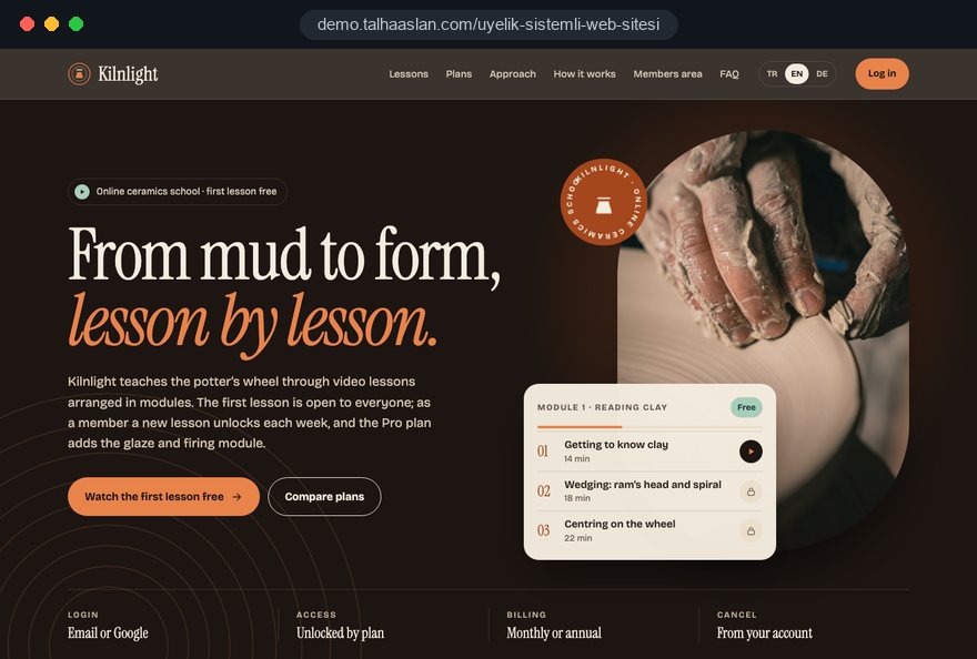
If you want to see our approach in practice, this page links to a live demo site where you can try sign up, plans and the account area yourself. Our work in other fields is on our references page.
To get started, send us a message with what you sell, how many plans you have in mind and which payment provider you use; we will prepare the scope and a written quote from that. If you are thinking of a standard website first, fixed packages are in our pricing section.