Ads point to the home page
The person who clicked the campaign lands among menus, service lists and news. If they cannot find the offer within a few seconds, they leave, and you have already paid for the click.

Your Windows contrast theme is on; colours come from your system.
Your device is set to reduce motion; animations are already off.
Your choices are saved in this browser only.
Web design solution
A landing page is designed to take the person who clicked your ad to one action: fill in a form, call, sign up. Unlike a company website that explains everything, it is built on one message, one goal and a measured result.
In short
A landing page is a focused page without site navigation, built to move visitors from an ad to one action. Its headline repeats the promise of the ad, the form stays short and every conversion is measured. Compared with sending ad traffic to your home page, the difference is focus: visitors find what they clicked for on the first screen, which also supports landing page experience in Google Ads.
Talha Aslan and teamLast updated:
When you need one
Not every business needs a landing page first. If you want to present your services and earn steady traffic from search, what you need is a full business website; a landing page does not replace it. But if you run ads, the losses below will sound familiar.
The person who clicked the campaign lands among menus, service lists and news. If they cannot find the offer within a few seconds, they leave, and you have already paid for the click.
The ad says free trial lesson, the page talks about something else. Google Ads treats landing page experience as one of the components of Quality Score, so a mismatch affects both conversions and cost.
A ten-field form on a phone screen is where most visitors give up. A first conversation usually needs only two or three fields.
If form submissions, calls and WhatsApp clicks are not tracked, budget is spread on guesswork; you cannot scale the winning campaign or switch off the losing one.
Sources: Google Ads Help: About Quality Score for Search campaigns
Our approach
We design the landing page as a continuation of the ad: visitors see the promise they clicked in the headline, understand the offer on the first screen and act with a single button. No menu, no unrelated links, no distracting sections.
Conversion tags are in place before the page goes live, so in Google Ads management you can see which keyword brought which enquiry. As data builds up, we test headline, image or form variants and keep the winning version.
For industry campaigns we combine this structure with sector knowledge; for a dental clinic, for example, an implant campaign page is written in language that respects health advertising rules.
No menu, no exits: every block serves the same action, and conversion tags are in place from day one.
Which campaign?
The action the campaign asks of the visitor decides the structure of the page.
Sign ups
Collects trial lessons and applications for schools, courses or events.
Quotes and appointments
Takes a quote or appointment request for service businesses in one step.
Promotions and launches
A time limited page for a discount, a new product or a seasonal offer.
What makes a landing page
Each element answers one question: should the visitor stay on this page, and what should they do now?
The headline repeats the promise of the ad in the same words. If you run several ad groups, each one points to its own variant.
The page asks for one thing only: a form, a call or a WhatsApp message. Form fields are limited to what a first conversation really needs.
Real references, certifications, Google reviews and contact details sit where the decision is made, next to the button.
Ad clicks often come from phones, so the page is kept light, images are compressed and the first screen loads without delay.
Conversion tags are set up on day one; cookie consent and Google Consent Mode are connected in line with the rules.
Once there is enough traffic, we run single-variable tests: headline, image, form length. Results are judged on data, not gut feeling.
Comparison
| Topic | Traffic to the home page | Landing page |
|---|---|---|
| Goal | Introduce the brand and every service | One action for one campaign |
| Navigation and exits | Dozens of links, visitors drift away | No menu, one path |
| Message match | A general headline that may not match the ad | The headline repeats the promise of the ad |
| Form | A general contact form | A short form built for the campaign |
| Measurement | Total visits and site wide conversions | Conversions at ad group level |
| Testing | Any change affects the whole site | Variants are tested without touching the main site |
Quick check
Must haves: does your site have them?
0 of 6 in place Tick the boxes to see where your site stands.
Added as needed
We choose which of these you need together during the scoping call.
Tell us which ads you run and what you want visitors to do; we will come back with a page structure and a written quote.
Process
We define your business, your audience and the site’s one-sentence job: who it sells what to, through which action. Scope and timeline are written from that answer.
The home page and key templates come to you as designs first; no code is written before your approval. We do not like surprises, and we do not cause them.
The approved design becomes fast, secure, maintainable code. You follow progress in the CRM and see every page in a staging environment before launch.
The site goes live with analytics, Search Console and conversion tracking connected; panel training is given, first-year hosting and maintenance included.
Search, speed and tracking
Variants built only for ads are usually kept out of the index so they do not create duplicate content in search results. If the page covers a lasting topic people search for, it is indexed and written for search as well.
The page goes through a mobile speed test before launch, and Core Web Vitals results are reported.
Form submissions, calls and WhatsApp clicks are sent to Google Ads and Analytics as conversions, so your bidding strategy works with accurate data.
The landing page can live in a folder under your main site or on a separate subdomain; brand, domain and tracking stay in the same accounts.
Free tools
Work out budget, conversion rate and test duration before the page is built, and prepare your ad copy and tracking links.
Tech SEO
Test whether a page works well on phones: viewport, font size, tap targets, a mobile screenshot and Core Web Vitals.
Conversion
Check whether your A/B test result is statistically significant and calculate the sample size and test duration you need.
Conversion
Calculate conversion rate, CPA and revenue per visitor, and plan how much traffic you need to hit your goal.
Analytics
Build correctly tagged links with Google Ads, social and newsletter presets.
Ads
Write the 15 headlines and 4 descriptions of a responsive search ad with live character limits, preview how the ad shows on Google mobile and desktop, and export it.
Ads
Work out the monthly and daily Google Ads budget you need from CPC, conversion rate and your goal, with CPA and ROAS.
Real projects
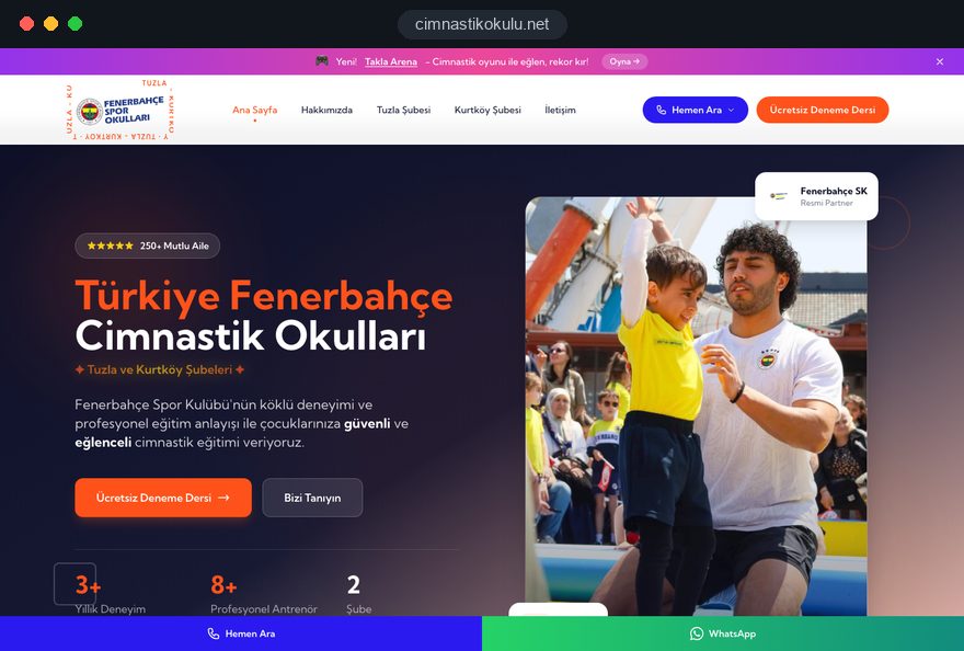
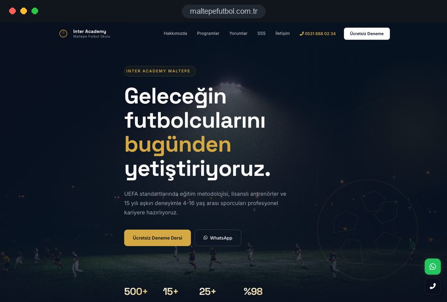
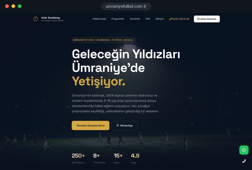
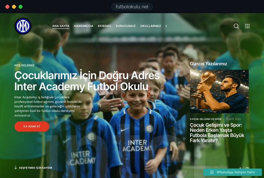
We have built pages for sports schools and courses that run alongside ads during enrollment periods. See all our work on the references page.
Sports education · web design, landing pages, ad management
Sports education · landing page design, Google Ads
Sports education · web design, landing pages, local SEO
Sports education · web design, landing pages, local SEO
Related pages
Industries
Landing pages for clinic campaigns, written within health advertising rules.
Locations
For businesses that want to be found in local search in Istanbul.
 How to Build a B2B Landing Page That Generates Sales OpportunitiesRead article
 What Is a Call to Action (CTA)? CTA Button Examples That ConvertRead article
 Google Ads Enhanced Conversions: What They Are and How to Set Them Up (Web, Leads, GDPR)Read article
 What Is a Conversion Funnel? How to Build One for Your WebsiteRead article
FAQ
If your question is not here, write to us; we will send you an answer and a written quote.
Next step
Tell us about your campaign, your budget and the action you want visitors to take; after a free 15-minute call we will send a written scope and quote.
In-depth guide
Landing page design covers the short stretch between a paid click and a decision. In those seconds the visitor checks whether the page keeps the promise of the ad, looks for the next step and judges whether you are worth contacting.
This guide follows the order in which we run a landing page project, from choosing which campaigns deserve their own page to tracking, testing and the end of the campaign. Where Google publishes a rule or threshold, we state it; where the answer depends on your data, we show how to find it.
A landing page is built for one audience, one offer and one action, and that focus defines it, not its length or layout. The term also causes confusion: in GA4, Google's analytics tool, every session has a "landing page," which means the first page viewed, so agree on the meaning before a project starts.
You need a landing page when you pay for traffic around a specific offer and your existing pages answer a broader question than the visitor asked. A landing page does not replace a website, though: careful buyers look a company up before they fill out any form, so build a credible business website first if you lack one.
Whether a campaign needs a dedicated page depends on what the visitor already knows and wants when they click, which varies by traffic source. Describe in one sentence what the visitor was doing just before clicking; the answer tells you how much the page has to explain.
Volume settles the rest. A separate variant pays off only when its ad group brings enough clicks to learn from and someone keeps its content current.
Message match means the visitor recognizes, at first glance, the words they searched and the promise they clicked; the chain runs from keyword to ad to headline, and every break costs attention. The practical rule is one page or variant per ad group theme, not one page per campaign.
Take an ad group built around "office cleaning contract" whose ad promises evening and weekend shifts and a quote within one business day. The headline should say "Office cleaning on evening and weekend shifts," the subheadline should repeat the quote timing and the button should read "Request my quote." An ad group for cleaning after renovation needs its own headline, image and button, even on the same template.
Responsive search ads combine your headlines in orders you do not control, so every headline you write must agree with the page; an ad preview tool shows how the combinations read before launch. If you insert search terms into the headline automatically, map each one to an approved headline instead of printing raw queries, because broad match, the setting that allows loosely related searches, brings in phrases you never planned for.
The first screen, the part visible before any scrolling and often called above the fold, must confirm the promise, define the offer and show the next step. We design it in the order the eye usually travels and give each element a single job:
Leave out the site menu, but keep the privacy notice and company details reachable in the footer. Then check the screen on a real phone, because browser bars and cookie banners take up space that design files never show.
The offer is what the visitor receives for taking the action, and it should be concrete enough that two people would describe it the same way. "Free consultation" is vague; "a 30 minute video call in which an engineer reviews your floor plan" says what happens, how long it takes and who joins.
Benefits need the same treatment. Replace adjectives with facts a visitor can check: instead of "fast service," state the response time your team actually keeps; instead of "experienced," name the qualification behind the claim.
Next, identify the main objection, the one reason a qualified visitor still hesitates, and answer it near the button rather than leaving it for the sales call. Objections usually concern cost, risk, effort or timing, so explain what the price depends on, what happens if the result disappoints, how much input you need from the customer and when work can start. Your call notes and inbox reveal which of these comes first.
Page length follows the size of the decision. A free checklist fits on one screen, while a yearly service contract needs a process outline, proof and a short FAQ.
Ask only for what your team needs to send a useful first reply, and collect the rest in the conversation that follows. For most service businesses that means three fields: a name, the contact method you will actually use and one qualifying question, such as the type of project.
Trust elements help only if a skeptical visitor could check them, so treat every badge, review and claim as something that must survive a quick search. Beyond the trust line on the first screen, put the fuller evidence next to the form, where hesitation peaks.
Invented reviews and false scarcity count as deceptive practices under consumer protection rules in the US, the UK and the EU. Regulated fields add duties of their own: in the UK, a dental website must show each professional's qualifications and GDC number, as our page on dental clinic websites explains.
A paid click that meets a slow page is often a lost click, so Google's Core Web Vitals thresholds are the floor for every page we build. They are assessed at the 75th percentile of visits, meaning at least three in four visits should reach the "good" level:
Page weight moves these numbers. Size the hero image for the screen that shows it, serve it in a modern format such as WebP or AVIF, and never lazy load it, because lazy loading makes the browser wait before fetching an image and so delays LCP. Give every image fixed dimensions so nothing shifts, and limit fonts to one family in two weights, hosted on your own domain.
Scripts are the hidden cost: every tag, chat widget and heatmap competes for the phone's processor, and some testing tools hide the whole page until their script loads. Low traffic pages often lack field data, meaning measurements from real visitors, so run a mobile test before launch and try the page on a midrange phone.
Tracking must be installed and tested before the campaign spends anything, because the first days of data teach you and the bidding system what a lead looks like. We set it up in this order:
Finish with a test lead from a phone. Confirm it appears once, in the right account, with the right source.
Landing page experience is one of the three Quality Score components, next to expected click through rate and ad relevance, and it is the one your page controls directly. Google describes Quality Score, a rating from 1 to 10 per keyword, as a diagnostic tool that is not used as a direct input in the ad auction, so treat it as a pointer to problems rather than a target.
To see it, add the Quality Score columns to the keywords view; each component is rated above average, average or below average, and low volume keywords show no score. When a landing page for Google Ads rates below average, Google's guidance points to four areas: relevance to the search behind the keyword, transparency about who you are and how you use data, easy navigation on any device, and load time.
Often the fix sits on both sides. An ad group whose search terms have drifted must be split before any page can match it, which is why our Google Ads management work treats keyword structure and landing pages as one job.
An A/B test shows two versions of a page to different visitors over the same period, and it is worth running only with one hypothesis, one changed element and a sample size calculated beforehand. Without those, the result is usually noise dressed up as a decision.
Variants built only for ads should usually carry a noindex tag, an instruction that keeps a page out of search results, while an evergreen page that stays relevant all year should be indexed and written for search. Noindex has no effect on ad delivery, so a hidden variant can still carry paid traffic.
Keep noindexed variants out of your XML sitemap and site menus. Where a variant nearly duplicates an indexed page, a canonical tag, which names the preferred version among similar pages, is the alternative; choose one clear signal per variant. On the evergreen page, a self referencing canonical stops UTM tagged addresses from competing with the clean one.
The common trap is robots.txt, the file that tells crawlers which paths to skip. A page blocked there cannot have its noindex read by Google, so to keep it out of the index it must stay crawlable with noindex. Also make sure robots.txt never blocks AdsBot, Google's ad crawler, because Google Ads must reach the destination to review it.
For evergreen pages in several languages, hreflang annotations tell Google about each version, and every version must reference the others and itself. Plan these pages within your wider SEO structure rather than as islands.
The landing page problems we are asked to fix usually trace back to six habits, each with a straightforward alternative. Check your current pages against them before spending more on traffic:
When a campaign ends, keep what has lasting value, retire the rest cleanly and record what you learned. Archive screenshots of each variant, the final copy, test results and cost per qualified lead by ad group in a one page summary; it becomes the brief for the next campaign.
Seasonal pages should return at the same address with updated content. Noindexed variants can be removed, an indexed page that has earned links should redirect permanently to the closest live page, and form data should be deleted once the retention period in your privacy notice has passed.
The team you choose matters as much as the design. When you compare agencies for landing page design, check four points:
To start, use the contact form to send us your current ads, where they point and what a good lead looks like. A standalone landing page is quoted in writing; packages for full websites are listed in the pricing section.
Start a Project
Thanks {name}, we've received your brief. We usually reply within the same day.
What happens next?