Sizes shown only in square feet
Most people cannot picture what 25 square feet holds. When units are not explained with rooms, boxes or furniture, visitors either rent too large a unit or phone to ask.

Your Windows contrast theme is on; colours come from your system.
Your device is set to reduce motion; animations are already off.
Your choices are saved in this browser only.
Industry-specific web design
People looking for storage usually arrive with one question: what size do I need, and when can I get in. We build self storage websites around choosing the right unit, clear access information and an honest account of security, so visitors can pick a unit and reserve it without waiting for someone to pick up the phone. We work with operators in the UK and elsewhere, fully online and in English.
Open the live demoA demo design we built for a fictional brand
In short
A self storage website shows each unit size with real examples, helps visitors work out the size they need, states access hours and security measures plainly and ends in an online reservation. If you take payment online, the terms and pre-contract information follow consumer law, such as the 14-day cancellation period for distance service contracts in the UK. The same structure works for a single site or a group of stores.
Talha Aslan and teamLast updated:
Why it needs its own approach
A self storage customer does not wait for a quote like a removals customer; they want to choose a unit, move their own things in and know when they can get access. Generic templates do not follow that decision.
Most people cannot picture what 25 square feet holds. When units are not explained with rooms, boxes or furniture, visitors either rent too large a unit or phone to ask.
If the site does not say whether customers can get in at weekends or in the evening, how the gate code is issued and whether they can drive up to the door, the most basic question stays unanswered.
Someone leaving their belongings for months wants to see CCTV, alarms, individual locks, fire and damp protection. Without real photos and plain detail, trust is left to a site visit.
When it is unclear whether goods are covered by the store's policy or the customer's own, and which items cannot be stored, disputes surface later at the worst moment.
Visitors find the right unit but have to wait for opening hours to hold it. Where online reservations or payment exist, pre-contract information and cancellation terms are often missing.
A family storing furniture between homes and a business storing stock, archives or equipment have different questions. A site that answers both on one page answers neither well.
Our approach
We build self storage websites in the order customers decide. First they work out how much space they need, then they learn when and how they can get in, and finally they read the security and contract details and reserve. That is why every size has its own card, there is a size calculator and every page ends in the same reservation flow.
If customers should pick a start date and pay a deposit online, a reservation system is connected to the site; for a new store opening or a seasonal offer, a single-goal landing page can go live without disturbing the main site.
Design, development and content sit in one team, so the calculator, reservations and tracking are not patched on later. Talha Aslan sets the strategy and an experienced team handles delivery, working remotely with operators abroad.
Home
Every size card leads into the same reservation flow, and the calculator takes visitors to the right card.
The right setup
All three start from the same foundation; the number of stores and the type of customer make the difference.
One store
Customers look for storage near them, so the site puts one store's sizes and access first.
Several stores
Each store gets its own page, because sizes and access differ from site to site.
Business
A business storing stock, archives or equipment asks about term, how often it needs access and invoicing.
Built for self storage
These are the questions storage customers ask before they decide.
For each size: dimensions, approximate volume and an example of what fits, such as the contents of one room, moving boxes or seasonal items. You set the rates and decide whether to show them on the cards.
Visitors pick items such as a sofa, a fridge or boxes; the calculator estimates the volume, suggests a unit size and links to that card. The suggestion is a guide; the final choice is confirmed at the store.
The days and hours customers can get in, how codes or cards work, the loading area and lift access, all on one page, so the most common question is answered without a phone call.
CCTV, alarms, locks, fire and damp measures shown with real photos. Insurance cover and prohibited items are written from your own policy and terms; the site never promises protection you do not provide.
Reserve a unit by start date, with an optional deposit and acceptance of terms. Under UK consumer contract rules, the cancellation period for a service contract made at a distance ends 14 days after the contract is entered into; we plan where this information sits in the flow, and your legal adviser sets the wording.
Separate pages for a family storing furniture between homes and a business storing stock or archives, each with its own questions, examples and enquiry form.
Comparison
| Topic | Generic business template | Site built for self storage |
|---|---|---|
| Size information | A list of square footages | Size cards with examples and a size calculator |
| Access | Opening hours on the contact page | Access hours, entry and loading area on their own page |
| Security | One line saying the site is secure | CCTV, locks, fire and damp measures with real photos |
| Reserving a unit | A general contact form and phone number | Online reservation by size, form and WhatsApp |
| Terms | Generic text in the footer | Pre-contract information and terms within the reservation flow |
| Measurement | Visitor numbers | Which size card brings reservations |
Quick check
Must haves: does your site have them?
0 of 6 in place Tick the boxes to see where your site stands.
Added as needed
We choose which of these you need together during the scoping call.
Tell us how many stores you run, which unit sizes you offer and how access works; we will come back with a page structure and a written quote.
Process
We define your business, your audience and the site’s one-sentence job: who it sells what to, through which action. Scope and timeline are written from that answer.
The home page and key templates come to you as designs first; no code is written before your approval. We do not like surprises, and we do not cause them.
The approved design becomes fast, secure, maintainable code. You follow progress in the CRM and see every page in a staging environment before launch.
The site goes live with analytics, Search Console and conversion tracking connected; panel training is given, first-year hosting and maintenance included.
Search and speed foundations
People do not only search for self storage; they add a town or area, type storage near me or search for where to keep furniture while moving. Size, store and guide pages are built to support the Google Business Profile.
Store name, address, phone and access hours are marked up so search engines can read them; nothing is marked up that is not on the page.
The calculator and size cards are designed for phone screens first, store photos are compressed and Core Web Vitals are measured before launch.
Reservations, forms, calls and WhatsApp clicks are tracked as conversions from day one, so you can see which size and which store page bring customers.
Free tools
Before planning a new site, test how your current one loads on a phone and appears in search, and use the unit converter to check square feet and cubic metres. The tools are free and need no sign up.
Tech SEO
Test whether a page works well on phones: viewport, font size, tap targets, a mobile screenshot and Core Web Vitals.
Tech SEO
Scan any URL for title, meta description, headings, canonical, indexability and speed signals, and get an SEO score with a clear to-do list.
SEO
Test your title and meta description with pixel-based measurement, desktop + mobile view.
Tech SEO
Generate rich-result JSON-LD for Article, Product, FAQ, Local Business.
Calculator
Length, weight, temperature, volume, area and speed; all units in one table.
Conversion
Create a wa.me link with a preset message + embeddable button code.
How we work
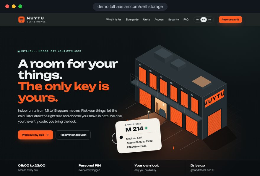
We do not have a live client project in this field yet, so we show our approach on a live demo site built by our team. The demo is not a client site. You can see our work in other sectors on the references page.
Live demo
For this field we built a one page demo site for a fictional brand, made only to show our approach. You can explore the design, the copy structure and the mobile view live in three languages.
Open the live demoBefore any layout, we list with you the sizes in each store, how many of each you have and which are asked about most, and build the size cards around that inventory.
Store photos, security measures and access hours come from your real details; we never use wording that implies a measure or insurance cover you do not provide.
We plan where pre-contract information, terms and the privacy notice appear in the reservation flow; your legal adviser sets the legal content.
Reservations, forms, calls and WhatsApp are set up as separate conversions and handed over so you can see which size and which page bring customers.
Related pages
Industries
For removal firms that also offer storage, with a structure built around quotes.
Industries
For logistics firms offering pallet warehousing and contract storage to businesses.
Solutions
Let customers pick a start date, reserve a unit and pay online.
Locations
For stores in Istanbul: a site structure built around district searches.
 Lead Form Design for Booking, Quote and Demo Requests: UX Rules That Lift ConversionsRead article
 How to Choose a Payment Gateway: What to Check Before You SignRead article
 How to Do Google Maps SEO: A Guide to Ranking Your Business Higher on the MapRead article
 How to Build Trust on Your Website: Trust Signals That Turn Visitors into CustomersRead article
FAQ
If your question is not here, write to us; we will send you an answer and a written quote.
Next step
In a free 15-minute call, in English, we will go through your stores, your unit sizes and the customers you want to reach, then send a written scope and quote.
In-depth guide
People rarely browse for storage at leisure. They are between homes, renovating or out of room at work, and they decide within a few tabs. A self storage website has to show three things quickly: which unit their belongings will fit in, when and how they can get to it, and how well it is protected while they are away.
In this guide, we at Talha Aslan and team go through the decisions a storage operator makes when planning a site, in the order they come up. Our general project process is on our web design service page.
The structure of a self storage site should come from your unit mix, the list of unit types you actually rent, rather than from a theme's demo layout. Without knowing how many units of each size you have, you cannot decide which sizes lead on the home page, which need a waiting list or what the calculator should recommend.
Before any design work, we ask operators to put this table together:
The table settles two decisions straight away. First, sizes that fill up regularly get a "currently full, join the waiting list" state, so a visitor who meets a full card leaves contact details instead of leaving the site. Second, large units households rarely ask about move to the business page.
After launch, keeping unit status current is the most important maintenance job. Agree at the start who updates the cards and how often.
Each size card should answer the visitor's real question, "will my things fit", with familiar objects rather than a bare number. Few people can picture 35 square feet, but almost everyone understands "the contents of a student room".
A good card carries the same information in the same order on every size:
Whether you publish rates on the cards is a commercial decision. If you do not, say plainly that rates are available on request. Consistency matters too: listing height on one card and not on the next sends people to the phone.
If your market mixes square feet and square metres, check every conversion with the unit converter before launch; one wrong figure across a set of cards undermines the rest.
A size calculator lets visitors pick their belongings, see an estimated volume and land on the matching unit card; built properly, it answers "which size do I need" without a call. It only works when it is calibrated to your own units.
We build it in this order:
When the item list arrives with the reservation, staff can spot an obviously wrong size before the customer turns up with a van. On a phone, the calculator must work with one thumb, with plus and minus buttons large enough to tap without zooming.
Once a year, review which items people select most and which missing ones they ask about.
Access information is the most practical page a self storage customer reads before signing, and it does not fit into a single "opening hours" line. At most stores, office hours and gate hours differ; if the site does not say so, a customer arrives one evening, finds the office closed and starts the relationship with a complaint.
The access page should answer these questions:
Alongside it, we recommend a dedicated move in day page: what to bring on the first visit, how the padlock is supplied, whether boxes and packing materials are sold on site.
Put the link to that page in the reservation confirmation. Feed both pages from the same admin field so a change to gate hours updates them together.
The security section has to persuade someone who will leave their belongings for months, and that takes visible evidence rather than adjectives; "state of the art security" tells the reader nothing. Visitors want to see how the gate, the corridor and their own unit door are protected before they visit.
Prepare a shot list before the photographer arrives:
Each photo gets one plain caption saying what it shows and how it works. Details such as how long CCTV footage is kept or who receives alarm alerts go on the page only as far as you have confirmed them; the site never implies a measure you do not have.
Because CCTV images can identify people, ask your adviser to check that the signage at the store and the privacy notice on the website say the same thing. A virtual tour supports the photos; it does not replace them.
Insurance and prohibited items are the details customers must read before a dispute, not after one, so they belong on a clear page ahead of the reservation rather than in small print. Every sentence should come from your policy and storage agreement.
We suggest answering three questions under separate headings: whether goods are covered by the store's policy or by the customer's own insurance; which events and limits the cover applies to; and how, and how quickly, a customer makes a claim. Where cover is not clearly defined, inviting the customer to ask is more honest than implying protection you do not provide.
The prohibited items list should be short and concrete. If your agreement includes them, these groups are the usual headings:
Repeating the list in the reservation flow with a checkbox records that the customer saw it. Update the page on the same day you change the agreement so the two never contradict each other.
Online reservations let visitors hold a unit without waiting for office hours, but if the flow includes payment or a contract, the place of the legal text must be planned at the same time as the design.
The flow we recommend:
In the UK, under the Consumer Contracts (Information, Cancellation and Additional Charges) Regulations 2013, the cancellation period for a service contract made at a distance ends 14 days after the contract is entered into.
We build the position of these texts and the record of each acceptance; your legal adviser sets the wording. When a calendar, payment and acceptance records are needed, a website with a reservation system provides the base for this flow.
Different customers arrive with different questions, and a page for each group lets visitors recognize their own situation and find the answer on the first screen. One "who it is for" list leaves most of those questions unanswered.
Each page has its own set of questions:
The business enquiry form should ask for volume, term, how often staff need access and invoicing details, and for small e-commerce sellers it should cover how many times a week they will reach their stock and whether the loading bay suits a van.
Households often decide on storage together with their removal company. If you also run removals, storage can share a quote flow with a removal company website; if you only rent units, a short block naming the removal firms you trust is enough.
People usually search for storage near them, so each store needs its own page and its own Google Business Profile, and both must say the same thing. If the details differ, neither search engines nor customers know which to trust.
A checklist for each store page:
Google Business Profile guidelines require the business name to match the real world name, without added keywords. A profile called "Cheap Storage Units Self Storage Centre" breaks that rule; the name on the sign is the name on the profile.
Beyond "storage near me" searches, people look for answers such as where to keep furniture while moving or how to store business archives. We plan guide articles for those searches and their links to store pages as part of our SEO service.
Storage is often searched on a phone in the middle of a move, so the site has to be designed for a phone screen first and load quickly. Google's Core Web Vitals give concrete targets, assessed at the 75th percentile of visits.
LCP, which measures how long the main content takes to load, is good at 2.5 seconds or less; INP, which measures how quickly the page responds to a tap, is good at 200 milliseconds or less; CLS, which measures how much content shifts while the page loads, is good at 0.1 or less.
The checks specific to a self storage website:
Before planning a new project, see how your current site behaves with the mobile friendly test. Also test on a weak connection: customers often open the access page in the car park or inside the building, where signal is poor.
On a self storage site, measurement should show which size card and which store page turn into reservations, not how many people visited. That tells you which size to promote and which page needs rewriting.
Events to track as separate conversions:
If the suggested and chosen sizes keep differing, the item volumes in the calculator need another look. Waiting list sign ups give you concrete evidence about which size to prioritize when you next reconfigure units.
Tracking must respect each visitor's cookie choice: in the EU, consent is needed before non essential tracking, and Google requires consent mode for measurement and personalized advertising features for users in the European Economic Area. For UK visitors, confirm the equivalent rules with your adviser.
We also add a field your team ticks when a reservation becomes a rental, which shows where requests fail to turn into move ins.
A storage rental runs for months, so the site should handle the routine requests of existing tenants as well as attract new ones. Otherwise routine requests all run through calls and messages.
Plan these topics for current customers:
Taking move out notices through a form records the dates and lets you contact the next person on the waiting list in advance, so the unit does not sit empty between tenants.
For a single store, a "current customers" page and a WhatsApp line may be enough. Multi store operators and those with many business tenants usually benefit from a customer account that brings invoices and extension requests together. You do not need the account on day one, but leaving room for it in the site structure avoids a redesign when the need arrives.
Most of the problems we see on storage sites come from breaking the order in which customers decide or from letting information go stale. Each has a better alternative:
None of these fixes needs a large budget, and most can be caught by a careful check before launch.
When choosing a team for a self storage website, look less at design samples and more at whether they treat unit mix, calculator, reservations and measurement as one flow.
Questions worth asking in the first meeting:
We do not have a live client project in this field yet, so the page links to a live demo our team built; try the size cards, calculator and reservation flow on your phone and note what would differ for your stores. Our work in other sectors is on the references page.
To share your stores, sizes and access arrangements, get in touch with us and we will prepare a written scope and schedule. Fixed price packages are in the pricing section, and the Get a quote form covers anything outside them.
Start a Project
Thanks {name}, we've received your brief. We usually reply within the same day.
What happens next?