The work is invisible
The latest news is two years old and events only appear on social media. A visitor cannot tell whether the organization is still active, so the decision to give gets put off.

Your Windows contrast theme is on; colours come from your system.
Your device is set to reduce motion; animations are already off.
Your choices are saved in this browser only.
Industry-specific web design
Before anyone gives money or time to a cause they do not know, they look it up: what does this organization actually do, where does the money go, who runs it? We build charity websites around current impact stories, open reporting and a donation page that follows the rules of the country you raise funds in, for UK charities, nonprofits elsewhere and Turkish associations reaching international donors.
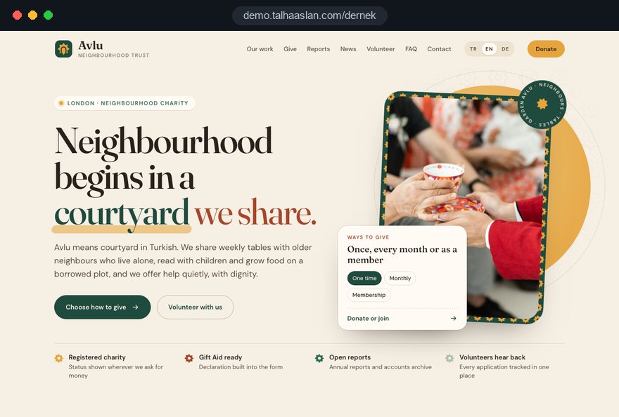
Open the live demoA demo design we built for a fictional brand
In short
A charity website shows what the organization does through current news, explains its income and spending in published reports, and leads visitors to donate, volunteer or join. In England and Wales, a registered charity above the income threshold in section 39 of the Charities Act 2011 must state that it is registered on appeals asking for money. The same structure works for associations and foundations.
Talha Aslan and teamLast updated:
Why it needs its own approach
A charity website has to earn trust and still stay within the fundraising rules of the country it raises money in, and those rules are not the same everywhere. Templates built for companies handle neither.
The latest news is two years old and events only appear on social media. A visitor cannot tell whether the organization is still active, so the decision to give gets put off.
Bank details are buried in a PDF, there is no card option and nobody explains what to write as a reference. Willing donors give up halfway and leave the page.
Under section 39 of the Charities Act 2011, a registered charity in England and Wales above the income threshold must state that it is a registered charity on notices, advertisements and other documents asking for money. A donation page copied from a template rarely shows it.
No annual report, no summary of income and spending, no list of trustees. When donors cannot find this, most of them do not ask; they simply give elsewhere.
Applications arrive by phone, social media messages and email, and nobody knows who replied to whom. A volunteer who hears nothing back joins another organization.
The member who built the site moves on and the passwords leave with them; nobody knows whose name the domain is in. Every change of trustees leaves the site a little more out of date.
Our approach
We do not build a charity website like a brochure; we build it in the order donors and volunteers make decisions. First they see what the organization does, then they read where the money goes, and finally they give or sign up without friction. That is why impact sits at the center of the home page, reports live in a public archive and the donate and volunteer buttons appear on every page.
We plan the donation page around how you actually raise money and where: a UK charity claiming Gift Aid needs a different form from a Turkish association accepting donations under its statute. Organizations with supporters abroad get a multilingual structure from day one, a members area can be added through a membership site, and an urgent appeal can go live as a single-goal landing page without disturbing the main site.
Design, development and content sit in one team, so none of this is patched on later. Talha Aslan sets the strategy and an experienced team handles delivery, remotely and in English. Domain and accounts are registered to the organization, so the site stays with the charity when trustees change.
Home
Every news story links to its project and to the donation page, so readers can support the work they have just read about.
The right setup
All three start from the same foundation; the structure of the organization and the way it raises money make the difference.
Member based
An organization powered by its members; the site keeps members informed and brings in new members and volunteers.
Endowed purpose
A lasting body tied to a set purpose; the site explains the purpose, the programs and how the funds are used.
Public appeals
An organization raising money from the wider public; the site tells each appeal clearly and within the rules.
Built for charities
These are the points that need the most decisions when a nonprofit site is planned.
Projects, events and announcements are added with photos from the admin panel in a few minutes. Each story links to its project, so the home page always shows the latest work.
Bank details with a sample reference, a card option and a thank you page after giving. We choose the payment provider together with you, based on the type of donation and your existing agreements.
HMRC guidance says a Gift Aid declaration must include the charity's name, the donor's full name and home address with postcode, a statement that the donor agrees to Gift Aid being claimed and confirmation that they pay enough tax. We build the online form around these fields; the final check belongs to your charity.
Annual reports, income and spending summaries and the list of trustees are archived by year. Reports are published as readable pages as well as downloadable files.
Forms ask about interests and availability, with the privacy notice right next to them. Requests are collected in one place and the right person is notified.
Domain, hosting and admin accounts are registered to the organization, and access is tied to roles rather than people. A change of trustees becomes a simple handover.
Sources: HMRC: Gift Aid declarations, GOV.UK
Comparison
| Topic | Generic business template | Site built for a charity |
|---|---|---|
| Our work | A few static pages, news never updated | A project linked news feed, easy to update from the panel |
| Donations | One bank account number at the bottom | Bank transfer, card donation and a thank you page |
| Fundraising rules | No charity status, no Gift Aid wording | Registration status and Gift Aid fields built in |
| Transparency | No reports or a single PDF | Reports and accounts archived by year |
| Volunteers and members | A general contact form | Separate signup forms tracked in one place |
| Measurement | Visitor numbers | Which story and which appeal bring donations |
Quick check
Must haves: does your site have them?
0 of 6 in place Tick the boxes to see where your site stands.
Added as needed
We choose which of these you need together during the scoping call.
Tell us about your work, how you raise money today and the supporters you want to reach; we will come back with a page structure and a written quote.
Process
We define your business, your audience and the site’s one-sentence job: who it sells what to, through which action. Scope and timeline are written from that answer.
The home page and key templates come to you as designs first; no code is written before your approval. We do not like surprises, and we do not cause them.
The approved design becomes fast, secure, maintainable code. You follow progress in the CRM and see every page in a staging environment before launch.
The site goes live with analytics, Search Console and conversion tracking connected; panel training is given, first-year hosting and maintenance included.
Search and speed foundations
People often search for the cause, not the charity: a topic they care about plus a town or region. When every project and area of work has its own page, the organization has a chance to appear in those searches.
Organization name, address, contact details and events are marked up so search engines can read them; nothing is marked up that is not on the page.
Donation and signup pages are designed for phones first; contrast, text size and form labels are checked against accessibility criteria.
Donate button clicks, signups and newsletter registrations are tracked from day one, so you can see which story or appeal brings support.
Free tools
Before planning a new site, see how the current one looks on a phone, whether its secure connection is in order and how it previews when shared. The tools are free and need no sign up.
Tech SEO
Test whether a page works well on phones: viewport, font size, tap targets, a mobile screenshot and Core Web Vitals.
Tech SEO
Scan any URL for title, meta description, headings, canonical, indexability and speed signals, and get an SEO score with a clear to-do list.
Security
Check an SSL certificate's validity, expiry date, issuer, hostname match, certificate chain and TLS versions in seconds.
Accessibility
Calculate the contrast ratio of two colors under WCAG 2.2, see AA and AAA results and get accessible color suggestions.
Sharing
Preview how your link looks on WhatsApp, Facebook, X, LinkedIn and Telegram, and find missing Open Graph tags and image problems.
Conversion
Turn URLs, WhatsApp, Wi-Fi, vCard and text into a QR code in seconds; download high-res PNG or SVG.
How we work
We do not have a live client project in this field yet, so we show our approach on a live demo site built by our team. The demo is not a client site. You can see our work in other industries on the references page.
Live demo
For this field we built a one page demo site for a fictional brand, made only to show our approach. You can explore the design, the copy structure and the mobile view live in three languages.
Open the live demoDonations under your governing document, public appeals, Gift Aid claims or all of them? We set the wording and fields of the donation page from your answer and leave the legal assessment to your adviser.
We use photos and figures from your own projects instead of stock images, and we never show an achievement or a number that you have not published or cannot back up.
Adding news and reports takes no technical knowledge, and your team gets a short walkthrough before launch.
Domain, hosting and admin accounts are set up in the organization's name and the access list is handed over in writing; the site belongs to the charity, not to a person.
Related pages
Solutions
For associations that want a members area with notices, documents and fees.
Solutions
A single-goal page for an urgent appeal, matched to ads and social posts.
Solutions
A page structure per language for nonprofits reaching donors and partners abroad.
Industries
For sports clubs run as associations: teams, fixtures and supporters first.
 How to Choose a Payment Gateway: What to Check Before You SignRead article
 How to Build Trust on Your Website: Trust Signals That Turn Visitors into CustomersRead article
 How to Build a GDPR and KVKK Compliant Website: A Business GuideRead article
 What Is Web Accessibility? Why WCAG Standards Matter for Your WebsiteRead article
FAQ
If your question is not here, write to us; we will send you an answer and a written quote.
Next step
In a free 15-minute call, in English, we will go through your work, how you raise money and the supporters you want to reach, then send a written scope and quote.
In-depth guide
A charity website has a few minutes to answer one question from a stranger: can I trust this organization with my money or my time? The donor, the student looking for volunteer work and the foundation considering a grant all look at the same pages and look for the same things: the work being done, where the money goes, who is in charge and an easy way to take part.
This guide walks through the decisions a charity, nonprofit association or foundation makes when planning a site, in the order they come up. Each section gives you a checklist, a criterion or a question to put to your agency; there are no invented numbers and no promised results.
Before anyone sketches a page, write down how you raise money and under which rules, because the wording and fields of the donation page follow from that answer. The rules depend on the country you raise funds in, not on where your web team sits, and they differ more than most trustees expect.
Work through these steps with your trustees before the first agency meeting:
This list becomes the specification for the donation page, the appeal pages and the footer. The legal assessment belongs to your adviser; our job is to build the fields, notices and wording that match the decision you make.
A news feed only builds trust if it stays current, so decide who writes, how often and to which template before you design the feed. Promising a weekly story is rarely realistic for a volunteer led organization; two stories a month published without gaps reassures donors far more than a feed that stopped two years ago.
A fixed template makes stories easier to write and keeps them consistent:
When photos show children or people receiving support, get explicit consent before publishing recognizable faces, or choose images that protect identity; pictures that strip people of dignity also cost donor trust. To share the writing load, ask each project lead for three sentences and two photos at the end of the month and let one editor shape them into a story. Every activity you post on social media should also have a permanent home on the site, because feeds disappear and a story on your site can still be found years later.
Project pages are the backbone of a charity site: once news stories and appeals link to them, the site stops being a scattered noticeboard. A scholarship program, a food bank, a tree planting scheme or a training workshop each deserves a permanent address of its own.
Each project page should answer these questions:
The project page is also the right place for donors who want to give to a specific purpose. If you show the exact payment reference to use for a bank transfer, your treasurer can allocate the gift to the right project without a phone call. Keep finished projects; marking them as completed in an archive shows your history and continuity.
Foundations that run grant or scholarship programs should state eligibility, the timetable, the selection criteria and how decisions are announced on the same page, and close the form outside the application window with the next opening date in view.
The donation page has one job: answer every question a willing donor might have, right there, because donors who have to ask usually do not; they leave. Bank transfer and card payment can both sit on the same page, so supporters choose the route they trust.
The page should include:
Keep the card form short, ask only for information you genuinely need and place the privacy notice right next to it. The thank you page that opens after a gift matters for measurement as well, because it is how you see which story led a visitor to give. The provider and its fees are your choice; we explain the options and connect the form, the thank you page and the notifications.
For UK charities that claim Gift Aid, the declaration belongs inside the online donation form, so it is collected at the moment of giving rather than chased afterward. HMRC guidance sets out what a declaration must contain, and a form designed around those fields saves your treasurer a great deal of follow up work.
According to HMRC, a Gift Aid declaration must include:
On the page, this works well as a clearly worded checkbox with a short explanation of what Gift Aid means for the charity, followed by address fields that appear only when the donor ticks it. A postcode lookup reduces typing on a phone. Declarations are stored with the date and the donation they relate to, so you can keep the records HMRC expects and answer questions later.
Two practical points are worth settling early. Decide whether the declaration covers only this gift or also future and past gifts, and write that choice in plain words next to the checkbox. Then agree who exports the declarations and how often, so the claim does not depend on a single volunteer remembering. The final wording should be checked by your charity or its adviser before launch.
A public appeal should live on its own page with a clear start and end, separate from the permanent donation page. That separation lets you tell one story well, show progress honestly and close the appeal cleanly without breaking links that people have already shared.
The legal notices differ by country, so build a dedicated notice area into every appeal template:
Write the need in sober, verifiable language and explain what the money will turn into. When the appeal ends, close the form instead of deleting the page and add a dated note on how the funds were used. If an urgent appeal must go live fast, it can run as a single goal page outside the main site, but the notice area travels with it.
The answer to "where does the money go?" belongs in a public transparency section, organized by year. A single PDF attached to the bottom of a page does not do the job; a visitor on a phone who does not want to download a file never opens it.
Set up the transparency section in this order:
A readable page works better than a file for accessibility and for search; a donor who uses a screen reader can reach the figures too. If your charity appears on a regulator's public register, link to your entry so donors can check it independently. Name your trustees with their roles; people want to see who governs the money. Your trustees decide what is published; we make it easy to find and easy to keep current.
When requests are spread across phone calls, messages and email, interested people go unanswered; volunteer and membership applications need two separate forms but a single place where they are tracked. Membership usually follows your governing document and a trustee decision, while volunteering is a looser commitment, and the forms should reflect that difference.
A volunteer form needs interests, available days and times and a preferred contact method. A membership form asks for what your governing document requires and explains how approval works. A privacy notice sits next to both forms, and sensitive information such as health details is not requested unless it is genuinely needed for the role.
The flow after submission is planned on the site as well:
Associations that want a members area with notices, documents and fees should plan the login from the start; adding it later means rebuilding the menu and the permission structure.
The most common way a charity loses its website is organizational, not technical: the volunteer who built it moves on and the passwords leave too. The fix is to open every account in the organization's name and tie access to roles rather than to people.
At handover, your trustees should hold these records in writing:
Turn on two factor authentication for the admin panel and close the accounts of departing volunteers on the day they leave. A single shared password on a panel that holds donor and applicant data is a security and data protection risk; individual accounts also make it visible who changed what. Add site access to the handover checklist used after each annual general meeting. Sports clubs run as associations face the same issue; for a structure built around teams and fixtures, see our page on sports club websites.
Much of your giving and volunteering traffic arrives from links shared on social media, which means from a phone, so donation and signup pages should be designed for phones first. A page that loads slowly or a form that is awkward on a small screen loses donors who had already decided to give.
Google's Core Web Vitals give a concrete target; staying within these thresholds for at least 75 percent of visits counts as good:
Accessibility matters especially for older supporters and visitors with low vision. Form fields need visible labels, error messages must use words and not only color, and buttons must be large enough to tap comfortably. You can check your current site with our free mobile friendly test and your color choices with the color contrast checker; more checks are on our free tools page. Resizing photos before upload keeps news pages fast even when a volunteer editor adds them, so build an automatic resize into the admin panel.
People often search for a cause rather than a charity: a topic they care about plus a town or region. Appearing for searches like "animal shelter volunteering in Leeds" or "foundation offering university scholarships" is only possible when each area of work is explained on its own page.
A sensible order of priorities for search:
News stories build into a content archive over time, and linking each story to its project helps search engines understand the site's structure. Organizations that want to treat search visibility as long term work can build on this foundation with our SEO service. Nobody can promise a timeline or a ranking; the right structure only improves the chances.
Measurement shows a charity where to spend its limited time; count real actions such as gifts, applications and newsletter signups instead of visitor numbers. Trustees who know which story or appeal post turned into donations plan the next appeal with evidence rather than guesswork.
The main events to track:
Adding source tags to the links you share on social media lets you tell the platforms apart.
Analytics must respect consent: in the EU, non essential tracking cannot start before consent, and Google requires consent mode for measurement and personalized advertising features for users in the European Economic Area. UK charities should check the ICO's current guidance on cookies. If you reach donors in several languages, plan a multilingual site structure early, which also keeps measurement separate by language.
Most of these mistakes come not from bad intent but from treating the website as a project that is built once and left alone. Each has a better alternative:
Run this list against your current site. If two or more items describe you, start by agreeing on content ownership and account ownership before you discuss a new design. Our guide on building trust on a website covers further signals worth checking.
When choosing a team for a charity website, ask how they handle donations and transparency before you look at design samples. These questions reveal experience and approach quickly:
With us, design, development and content sit in one team; Talha Aslan sets the strategy and experienced team members handle delivery, remotely and in English. We do not have a live client project in this field yet, so we show our approach on a live demo site linked on this page; our work in other industries is on the references page. The broader scope of our web design service is described separately.
Packages with a fixed scope are listed in the web design pricing section. To talk about your work, how you raise money and the supporters you want to reach, get in touch with us, and we will reply with a written scope and quote.
Start a Project
Thanks {name}, we've received your brief. We usually reply within the same day.
What happens next?