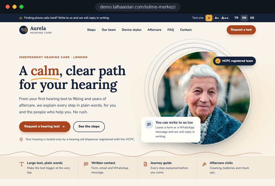
A hearing care website is not measured by visitor numbers. It is measured by how many people arrive for a hearing test with the right expectations, and by whether existing patients can ask for batteries, an adjustment or a repair without having to phone. Hearing care is regulated, so the site explains, builds trust and brings people through the door rather than selling devices.
In this guide, Talha Aslan and team walk through the decisions we make, in order, when planning a website for an independent hearing practice: who reads it, the professional rules, page structure, readability, the test request, device pages, the hearing journey, the team, aftercare, personal data, local search, measurement, common mistakes and choosing a partner. The clinical accuracy of every sentence belongs to your registered dispensers and audiologists; we build the structure, the language and the technical foundation.
01Decide who is actually reading the site
Planning a hearing practice website should start with the question in the visitor's head, not with the device range. In our experience visitors fall into one of four groups, and each group looks for something different first, so the home page should open four clear doors.
- The person whose hearing has changed: often reading a phone without glasses and reluctant to call; they need large text, short sentences and a written way to get in touch.
- The family member helping them: usually a son, daughter or partner who reads the test process, the device options and the costs in detail before suggesting a visit.
- The referred visitor: someone who has already seen a GP or an ENT doctor and wants to know your opening days, what to bring and how long the process takes.
- The existing patient: their battery has died, a dome has split or the aid is whistling; they want a service slot without joining the queue for new tests.
To test your current site, put yourself in each of these four positions and count the taps from the first screen to the answer. Every path longer than three taps comes back as a phone call the next morning.
02The professional rules that shape your hearing website
Before any design work, the site has to fit the rules of the profession, and those rules change what goes on each page. In the UK, the HCPC states that only a registered hearing aid dispenser may assess or test hearing or prescribe a hearing aid where it is supplied by retail, sale or hire. Standard 9.3 of the HCPC standards of conduct asks registrants to make sure any promotional activity they are involved in is accurate and not likely to mislead.
These points translate into website decisions we agree before the page plan is written.
- Who is named: the people who test hearing and fit devices appear with their registration details, so visitors can check them on the public HCPC register.
- Outcome claims: phrases that promise perfect or restored hearing, or describe devices as invisible miracles, stay off every page.
- Brand offers: limited time manufacturer deals and model comparisons built to push a sale are kept out of the guides.
- Prices: if you show prices at all, they must be accurate, complete about what is included and kept up to date; many practices prefer to explain what the cost depends on instead.
Advertising rules apply on top of professional standards, and outside the UK your own regulator sets the frame. We flag any borderline phrase for your practice and its adviser to decide.
03Plan the page structure in the right order
The page structure of a hearing practice website should follow the order of questions a visitor asks before they walk in. We build it in these steps, with your sign off after each one.
- Question list: we ask your reception team and clinicians to write down the ten questions they heard most often on the phone last month; that list is the raw material for the plan.
- Main menu: hearing test, device types, your hearing journey, our team, aftercare and contact become the six main items, and the menu stays at that length.
- Sub pages: behind the ear, in the ear, receiver in canal and rechargeable styles get their own pages, as do the steps before the test and after fitting.
- Branches and children: each location gets its own page, and a practice that sees children adds a separate guide for parents.
- Legal pages: the privacy notice, cookie notice and registration details are planned with the first draft, not bolted on before launch.
Each page gets one written purpose: the test page leads to a test request, the journey guide answers how the process works, the aftercare page leads to a service request.
04Readability for older visitors comes first
The first design decision on a hearing care website is not the color palette or the logo; it is whether someone looking at a phone without reading glasses can read the text. A large share of your visitors are older, and eyesight, fine motor control and familiarity with websites differ from those of a typical business audience.
- Text size: body text is noticeably larger than on a typical site, line spacing is generous, and nothing stops visitors from zooming in their browser.
- Contrast: dark text instead of light gray, with color contrast at WCAG 2.2 AA level; WCAG is the international guideline that defines how accessible web content is for people with disabilities.
- Touch targets: buttons wide enough for an unsteady finger, with clear space between any two things that can be tapped.
- Simple navigation: few dropdown layers and one test request button that sits in the same place on every page.
Every video gets captions; explaining things only by voice on a website for people with hearing loss shuts out the very audience it is meant for. You can check your current colors with our free color contrast checker and see how plain your copy is in the readability checker. Pages with long sentences and dense clinical terms are the first ones we simplify.
Before launch, ask an older patient or relative to request a hearing test on the draft using their own phone, and note where they pause. Five minutes of this tells you more than a long design discussion.
05The hearing test page and the request flow
The test page is the hardest working page on the site, and it should remove every uncertainty before the visitor arrives. We describe what happens in the test, roughly how long it takes, what to bring, whether a relative can come along and what the visitor will know when they leave.
Whether the test is free or charged is the most misunderstood sentence on most hearing practice websites. We settle the wording with you and keep it plain; a site that says free followed by a charge at the practice loses trust on the first visit. For the request itself there are three routes.
- Short request form: name, phone, preferred days and a choice between a call back and a written reply; your team calls back and agrees a time.
- Online calendar: the visitor picks a slot, and confirmation and reminder messages go out automatically.
- WhatsApp: open on every page for visitors who find calls difficult, with a prefilled first message.
If you want visitors to choose their own slot, we connect an online booking system to the site. Whichever route you choose, the form must offer a written reply option for people who do not want a call; answering someone with hearing loss only by phone defeats the purpose of the form.
06Writing device style pages that inform, not sell
Device pages should explain which hearing aid style might suit which person and lifestyle; they are guides, not a shop window. We create separate pages for behind the ear, in the ear, receiver in canal and rechargeable styles, and build each one on the same frame: how it is worn, when it tends to be considered, how it is maintained and which questions the visitor should ask at the appointment.
The same information can be written two ways:
- Avoid: "Hear like you used to with our invisible device"; prefer: "In the canal styles sit inside the ear canal and are less visible from outside; whether they suit you depends on the shape of your ear and your hearing loss, which your dispenser assesses."
- Avoid: "Our most popular model this month"; prefer: "Rechargeable aids need no battery changes; they go into a charging case overnight."
- Avoid: tables of model codes, brand logos and prices; prefer: a short plain comparison of styles by everyday use, care and visibility.
Each device page ends with the same sentence: the right style is decided after a hearing test and a professional assessment. That line keeps the page factual and gives the visitor a natural reason to move on to the test request.
07Explaining the hearing journey step by step
Family members want to understand the whole route before they suggest a visit, so a written hearing journey guide removes more phone calls than any other page. We build it as a numbered sequence in plain language, using only the process and details your practice provides.
- First concern: common everyday signs people notice, written without diagnosing, with a clear note that only a test gives an answer.
- Before the test: whether a referral is needed in your setting, what to bring and how to prepare.
- The appointment: what happens in the room, how results are explained and whether a decision is expected on the day; the honest answer is usually no.
- Fitting and follow up: how the device is fitted, how many review appointments follow and what adjustment period people can expect.
- Long term care: servicing, hearing checks at intervals your clinicians recommend, and how to reach you when something goes wrong.
Where patients ask about NHS and private routes, we present the information you supply in your own words and avoid general claims about either route. Any figure carries a last updated date.
08Showing registered clinicians and building trust
For someone about to wear a medical device, the first trust question is who will test their hearing and fit it, which is why the team page is one of the most read pages on a hearing practice website. We present each dispenser and audiologist with a real photo, their role and a short note on what they focus on.
- Registration: each profile shows the HCPC registration number, so visitors can check it on the public register themselves.
- Clear roles: plain descriptions such as "carries out hearing tests", "fits and adjusts devices" or "handles repairs and servicing".
- Real photos: your own test room, waiting area and entrance instead of stock images, so a first time visitor recognizes the door.
- Reviews: if Google reviews are shown, choose ones about the service experience; reviews that read like promises of results are not featured.
The team list must be easy to update; a clinician who left months ago still smiling from the site unsettles a visitor who meets someone else at the practice.
09An aftercare section built for existing patients
Batteries, domes and wax filters, cleaning, adjustments and repairs are why patients keep coming back for years, and they deserve their own section. Taking a new test request and an urgent repair through the same form means two very different levels of urgency end up in one queue.
We build it from these parts, written with whoever handles service at your practice.
- Service request form: device style, type of problem (no sound, whistling, discomfort, battery) and preferred contact route; the request goes straight to the person who handles it.
- Service times: drop off and collection times, drop in days and typical turnaround, stated plainly.
- Short care videos: captioned clips of a minute or two on changing batteries, replacing wax filters and using the charging case.
- Simple checks first: a short list of things patients can try before coming in, such as checking the battery or cleaning the dome.
The tone of this section is service, not sales; upgrade offers and new device promotions have no place here. Built properly, the aftercare pages relieve your phone line more than any other part of the site.
10Personal data: what a test request should not ask
Requests sent through a hearing care website can contain health information, which counts as special category data under the UK GDPR and the EU GDPR, so the first question when designing a form is what not to collect. Name, phone number and preferred days are enough for a test request; the degree of hearing loss, medical conditions or medicines are not asked on the form.
- No uploads: we do not ask visitors to upload audiograms or letters through the site; those are handled at the practice within your own records system.
- Privacy notice: a link sits directly under every form, and the notice itself is approved by whoever advises your practice on data protection.
- Notification routing: form submissions go to the people who need them, not to a shared inbox that everyone can read, and unnecessary copies are switched off.
- Cookies: analytics and measurement cookies are non essential, and in the UK and the EU they need consent before they are set; the cookie banner is built on that basis.
The same care applies to WhatsApp: the first automatic reply can ask people not to share health details in the chat and explain that you will discuss them at the appointment.
11Local search, branch pages and mobile speed
Searching for hearing care is mostly a local search: people type a town or district, or look for a hearing test near them,. Your website, your Google Business Profile and the sign above your door should therefore show the same name, address and opening hours.
- Business name: Google's guidelines require the profile name to match the real world name, without added keywords; adding service terms to the name puts the profile at risk.
- Branch pages: each location has its own page with its own address, team, map and opening hours; we never clone one page and swap the town name.
- Structured data: practice name, address, phone and hours are marked up so search engines can read them, and nothing is marked up that is not on the page.
- Speed: by Google's measures a good page has an LCP, the time to show the largest content, of 2.5 seconds or less, an INP, the response to a tap, of 200 milliseconds or less, and a CLS, layout shift, of 0.1 or less.
A slow page feels broken to an older visitor, and a button that jumps while the page loads leads to the wrong tap. You can start by running your current site through our mobile friendly test; if you want to grow local visibility over time, our SEO service explains how we approach it.
12Measurement: knowing which request came from where
On a hearing practice website, what matters is the type of request, not the number of visits; without counting new test requests and service requests separately, you cannot make sound decisions about the site. We set up measurement from launch day and define the events below as separate conversions, a conversion being an action on the site that has value for you, such as sending a form.
- Test request form: every submission, together with the page it came from.
- Service request form: aftercare requests, reported separately from test requests.
- Tap to call: taps on the phone button on mobile, with the page where they happened.
- WhatsApp clicks: tracked separately to see how many visitors prefer a written route.
- Directions: map and directions clicks, the closest sign that someone intends to visit.
Once a month, compare these numbers with your own records: how many test requests came in, how many people attended and which question was asked most on the phone. A question that keeps coming up by phone becomes the next content update. Measurement tags only run after consent, so nothing loads for a visitor who declined.
13Common mistakes on hearing practice websites
The mistakes below are the ones we see most often on hearing care websites and the ones that cost the most effort to fix later.
- Building a brand and model showcase: pages full of product codes and logos read as promotion; instead, build guides that explain device styles through daily use and care.
- Offering only a phone number: people with hearing loss often avoid calling; add WhatsApp and a call back form next to the number on every screen.
- Leaving the process unexplained: rather than "call us for details", publish a dated hearing journey guide that walks through each step in order.
- Vague wording about a free test: if the practice does something different, trust is lost on the first visit; agree the conditions and state them in one plain sentence.
- Mixing aftercare into the test form: an urgent repair waits behind new enquiries; use a separate form with its own recipient.
- Using stock photography: smiling models do not introduce your practice; photograph your own team, test room and entrance.
Most of these mistakes come from questions nobody asked at the planning stage, not from design. Put this list to any agency you consider when asking for quotes.
14Choosing a partner and the next step
When choosing a team for your hearing practice website, ask how they handle professional rules and older visitors before you look at design samples. Clear answers to the questions below are a good first filter.
- How do you handle prices, offers and outcome claims within HCPC standards and the advertising rules that apply to us?
- How do you test readability and contrast before launch?
- How do you separate test requests from service requests, and who receives each notification?
- How do you record who approved the clinical accuracy of each page?
We answer each of these in writing at the start of a project and send the page plan, request flow and measurement setup together with the quote. We do not yet have a live client project in hearing care to show, so our approach can be seen on the live demo site linked on this page, and our other client work is on our references page. For a related field where devices are also fitted and supplied, our approach for optician websites may be useful too.
Our overall scope is described on our web design service page, and fixed price packages are in the pricing section. To share how your practice runs tests, how many locations you have and how aftercare works, get in touch through our contact page, and we will reply with a written scope and quote.