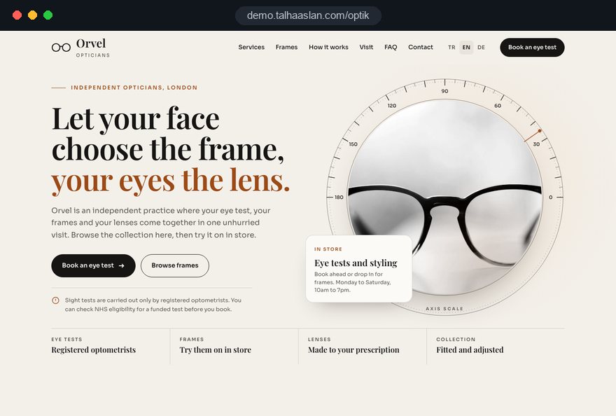
An optician website earns its keep when a patient can request an eye test, check that you stock the frame brand they want and reorder contact lenses without picking up the phone. Each of those journeys has its own rules, its own questions and its own measure of success, and a generic shop template treats all three as a product grid.
In this guide, Talha Aslan and team set out the decisions we make, in order, when planning a site for an independent optician or a practice with several branches: the legal frame, the eye test page, booking options, brand pages, photography, branch pages, lens reorders, patient data, copy tone, speed, search, measurement, common mistakes and how to choose a partner. Clinical accuracy always stays with your optometrists; we build the structure, the wording and the technical foundation.
01Three visit reasons that shape the home page
Plan an optician site around why people arrive, not around your product categories. Almost every visitor comes with one of three intentions, and each needs a different first answer.
- An eye test is due: they want to know when you can see them, who carries out the test and what it involves.
- A frame caught their eye: they saw a brand or model somewhere and want to know whether you carry it and at which branch.
- Lenses are running low: a returning wearer wants the shortest possible route to a reorder.
We give each intention its own entry point on the first screen: an eye test request, a brand directory and a lens reorder link. The branch finder sits at the end of all three paths in the same place, so patients learn where to look. Sunglasses and new arrivals live inside the brand directory rather than competing for space at the top.
A quick test for your current site: open it on a phone, play each of the three visitors in turn and count the taps from the home page to the answer. Anything above three taps tends to come back to you as a phone call or a message, and some of those visitors simply book elsewhere. Write the counts down; they make a useful baseline when you compare the new site later.
02What the Opticians Act means for the site
In the UK, two sections of the Opticians Act 1989 shape an optician website more than any design choice. Reading them with your team before the sitemap is drawn saves rewriting pages later.
- Section 24: only registered optometrists and registered medical practitioners may test sight, so the site states clearly who carries out tests at each branch.
- Section 27, contact lenses: a lens may not be sold without a valid specification, the seller must verify it, and the sale must be supervised by a registered professional.
- Section 27, protected groups: optical appliances for under 16s and for people registered as sight impaired must be sold by or under the supervision of a registered professional, so those patients are directed to a branch.
Practices outside the UK work under their own national rules; the structure in this guide still applies, but the detail of who may test and how lenses may be sold must be checked with your regulator or professional body. This guide is not legal advice, and final compliance always rests with the practice.
One practical habit helps: keep a short compliance note in the project file that lists each rule, the page it affects and who on your team approved the wording. When a page changes a year later, that note tells the next person what must not be lost.
03An eye test page that answers before reception has to
The eye test page should answer the questions your reception team hears every day, in the order patients ask them. When the answers are on the page, the request form gets used and the phone gets quieter.
- Who tests: the registered optometrists at each branch, with their names and registration shown as they really are.
- How long it takes: a plain statement of the usual appointment length and what happens in it.
- What to bring: current glasses, lens details for wearers, a list of medicines and the name of any eye drops used.
- Funding: a short note on where patients can check whether they qualify for an NHS funded test, without listing rules that may change.
- Access: step free entry, parking and whether a home visit service is offered.
Avoid copy that promises outcomes, such as clearer sight or fewer headaches. Describe the process, not the result; the result is a clinical matter for the optometrist in the room.
Children deserve their own short block on the same page: from what age you see them, how a test for a young child differs and what parents should bring. Parents search for this specifically, and a clear answer reassures them before they ever call. Keep the wording factual and have your optometrists approve every line before it goes live.
04Choosing between a request form and live booking
How patients book is a business decision before it is a design decision, and there are three workable options. The right one depends on how predictable your diary is and how many branches share it.
- Request form: the patient picks a branch and preferred times, and reception confirms. It suits practices whose diary changes often or where test types vary in length.
- WhatsApp or phone link: a one tap message to the branch. It suits small practices where the same person answers messages and the phone.
- Live diary: patients choose a slot themselves through an online booking system connected to your practice software. It suits practices with standard appointment lengths and several optometrists.
Live booking reduces back and forth, but only if the diary is reliable; a slot that turns out not to exist does more damage than a form. Before connecting a calendar, check whether your practice software offers a secure booking link or an interface the site can use, and who keeps the slot types up to the minute.
Whichever option you choose, keep the form short: name, phone, branch, preferred time and a free text box for anything the team should know. Every extra required field loses some patients on a phone screen. Send an automatic confirmation that repeats the branch address and what to bring.
05Brand and frame pages people actually search for
Brand pages are often the most visited part of an optician site, because people search for eyewear by brand. A good brand page does not repeat the brand's own marketing; it shows what that brand looks like in your practice.
Write each brand page in your own words: which frame styles the brand does well, which branches carry it and roughly how many models are on display. Then give every model card the details that help someone decide before they visit.
- Frame measurements: lens width, bridge and temple length, which patients can compare with the numbers inside their current glasses.
- Material and weight: acetate, metal or titanium, which matters for all day wear.
- Color options: a photo for each colorway, named as the brand names it.
- Branch availability: where the model is on display, with a button to call that branch.
- Save to try: a way to save a frame and ask a branch to put it aside, instead of a checkout for prescription eyewear.
If you carry hundreds of frames, a filterable catalog by brand, shape, material and branch keeps browsing manageable. Check your supplier agreements on logo and image use before launch; some brands set rules on size, placement and background.
06Frame photography that stays consistent and fast
Eyewear is hard to photograph well: lenses reflect, clear acetate disappears into white backgrounds and thin metal temples vanish. Without a written photo standard, brand pages end up as a patchwork of different angles and lighting.
We write that standard before the first shoot so your team can photograph new arrivals the same way.
- Use one light neutral background and soft light from both sides to keep reflections down.
- Shoot at least three angles per model: front, side and three quarter.
- Resize every image to the size it is shown at and convert it to a modern format; a free image resizer is enough for this.
- Name files after brand and model, and describe the frame shape and color in the alt text.
- Remove discontinued models the day they leave the shelf, or mark them as no longer stocked.
Heavy images are the most common reason optician sites feel slow. In Google's Core Web Vitals, LCP measures how quickly the largest element on the page loads, and the good threshold is 2.5 seconds or less; on a brand page, that largest element is almost always a frame photo.
07Branch pages and your Google Business Profile
Give every branch its own page, because the final choice for many patients is simply the nearest practice. A single page listing every address gives map searchers too little and gives search engines nothing to tell branches apart.
The basics are obvious; the value is in the detail patients ask about: bank holiday hours, parking and public transport, step free access, which brands are on display and which optometrists usually work there.
- Business name: Google Business Profile guidelines require the real world name, without added keywords such as eyewear or a town name.
- Address and phone: written exactly the same on the site, the profile and every directory listing.
- Hours: holiday hours updated on the profile and the site on the same day.
- Photos: shopfront, interior and team, so patients recognize the practice when they arrive.
We mark up branch details as structured data and never mark up anything that is not visible on the page. You can see in seconds whether your current site has this markup using a structured data checker. When a branch closes, its page is redirected to the nearest branch and the profile is updated the same day, rather than left as a dead end.
08A contact lens reorder flow with proper checks
A lens reorder should be the shortest journey on the site for a patient who is in date, and a firm stop for one who is not. Under section 27, the sale needs a valid specification that the seller verifies and supervision by a registered professional, so the flow is built around that check.
- The patient chooses their branch and confirms their details.
- They enter or confirm their lens specification and the date it expires.
- The form checks the expiry date and blocks orders with an expired or missing specification, offering a branch visit instead.
- Orders for under 16s or patients registered as sight impaired are directed to the branch rather than accepted online.
- A registered professional at the branch reviews the order before it is confirmed and dispatched.
The form supports the check; it does not replace it. Your practice remains responsible for verification and supervision, and the site makes that responsibility easy to carry out by sending every order to the right branch with the details already laid out.
Keep lens reorders visually and technically separate from frame pages. A practice that sells lenses online still has no reason to put a basket on prescription spectacles, and separating the two flows prevents a frame from ever being added by mistake.
09Health data, privacy notices and cookie consent
Eye test requests and lens orders carry health information, which UK GDPR treats as special category data. That means collecting only what you need, explaining it clearly and storing it somewhere the right people, and only they, can reach.
- Minimum data: the eye test form asks for name, contact details, branch and preferred time; symptoms are discussed in the test room, not in a web form.
- Privacy notice: a plain language notice linked next to every form, explaining what is collected, why and for how long.
- Storage: submissions go to a practice inbox or system with limited access, not to a personal phone or a shared mailbox.
- Processors: booking tools, form services and messaging apps need a data processing agreement in place.
- Cookies: for visitors in the UK and the EU, non essential tracking runs only after consent, and the consent banner gives a real choice.
If you run WhatsApp lines per branch, decide who reads them and how long messages are kept. We place notices and consent in the right part of each flow; the wording of the privacy notice itself should be reviewed by whoever advises your practice on data protection.
10Copy tone that stays accurate and trusted
Optician copy works when it sounds like a calm conversation with the optometrist, not like a sale. Accuracy is also a safety matter: patients act on what you write.
Before writing, we agree a short list of phrases to avoid and their replacements with your clinical lead.
- Instead of perfect vision: a sentence that explains which lens type suits which daily use.
- Instead of specialist eye care: the actual roles and registrations of the people who see patients.
- Instead of countdown offers: information about new collections and which branch has them.
- Instead of diagnosing in a blog: a closing line that tells readers when to book a test or see a doctor.
Titles matter. Show each person's name, role and professional registration exactly as held; dispensing opticians, optometrists, contact lens opticians and practice staff are different roles, and patients should be able to tell who does what. Any clinical statement, including those in eye care guides, is approved by your optometrists before publication, and the approval date is kept with the page.
11Speed and one handed use on a phone
Most optician visits happen on a phone, often on the move: straight after a reminder letter, in a shopping centre or on a bus. Design for one hand and a weak connection first.
Google's good thresholds for Core Web Vitals apply at the 75th percentile of visits: LCP 2.5 seconds or less, INP, which measures how quickly the page responds to a tap, 200 milliseconds or less, and CLS, which measures how much the layout jumps while loading, 0.1 or less. Frame galleries often fail CLS when buttons jump down as photos load.
- Sticky bottom bar: call, directions and eye test request within thumb reach.
- Branch choice: a list first, with location permission requested only if the visitor taps for it.
- Galleries: image dimensions set in advance so nothing shifts.
- Readable text: hours and addresses large enough to read without glasses, with strong contrast.
That last point matters more here than in most fields: some of your visitors are on the site precisely because they cannot see well. Run your current pages through a mobile friendly test, then try them on a phone with display zoom switched on.
12Local, brand and question searches
Searches that lead to an optician fall into three groups, and each lands on a different page type: nearby searches, brand searches with a town name and questions about eyewear. We plan search engine optimization around those page types rather than around a keyword list.
Nearby searches depend on branch pages and the Business Profile working together. Brand searches want to see what that brand looks like in your practice, which is why branch and model details belong on the brand page. Question searches are served by an eye care guide.
- How to choose frames for your face shape, with examples for oval, round and square faces.
- How to read the three numbers on the inside of a frame arm.
- How to clean glasses without scratching the lenses.
- What to look for on the label when buying sunglasses.
- Choosing durable frames that fit children well.
Every guide on a health topic ends by sending readers to an eye test or a doctor, and none tries to diagnose or treat. At the foot of each guide, link calmly to the relevant brands and the nearest branch, not to an offer.
13Common mistakes on optician websites
Most mistakes on optician sites come from shop templates that ignore how the profession works. Each of the six below takes hours, not weeks, to fix when caught before launch.
- A basket on prescription frames: replace it with a save to try button that asks the branch to put the frame aside.
- A lens checkout without checks: build the reorder flow around the specification and its expiry date, with branch review before dispatch.
- The eye test buried in a menu: put the request on every screen and answer what a test involves on the same page.
- One page for every branch: give each branch its own page with hours, map, phone, team and brands.
- Brand pages copied from suppliers: write about the models you actually stock and the branches that carry them.
- A showcase that never changes: update new arrivals and discontinued frames on a weekly routine from the admin panel.
Use this list as an audit of your current site. If two or more apply, start a rebuild from the legal frame and the branch structure rather than from colors and fonts; a visual refresh is easy to add on top of a sound structure, while the reverse rarely works.
14Choosing a partner and planning the next step
The first sign of a good partner for an optician website is that they raise the rules on testing and lens sales before they show you a design. If the first proposal is a shop template with a basket on every frame, the team has missed how the profession works.
Questions worth asking in the first call:
- How will the lens reorder flow check the specification and route orders to a branch?
- Which booking option would you recommend for our diary, and why?
- How will we update frames, hours and branch details ourselves?
- Which actions will you measure per branch from the first day?
- Who on your side writes the copy, and how does our optometrist approve it?
We put the answers into a written scope before any page is designed, and nothing goes live without your clinical sign off. A live demo site showing our approach for opticians is linked on this page, and our client work is on the references page.
To come prepared, gather your brand list, branch details and hours, the state of your product photos and your current booking process. You can read about our web design service, see packages in the pricing section, and when you are ready, get in touch with those details for a page structure and a written quote.