Nobody can tell what the product does
The home page offers slogans and abstract icons, so visitors cannot see on the first screen whose problem the product solves. Without real screenshots and a concrete scenario, they switch to a competitor's tab.

Your Windows contrast theme is on; colours come from your system.
Your device is set to reduce motion; animations are already off.
Your choices are saved in this browser only.
Industry-specific web design
Software is rarely bought on the first visit. People look at features, compare plans, skim the docs and only then start a trial or ask for a demo. We build SaaS websites around that path, and because our team builds and runs software products of its own, we know the steps from signup to first login from the inside.
In short
A SaaS website is the marketing site that explains a software product and leads visitors to a free trial or a demo request. Each core feature gets its own page, plans are compared in one table, and public documentation and a changelog build trust. Building the product itself is a separate job; this page covers the site that sells it.
Talha Aslan and teamLast updated:
Why it needs its own approach
A software company website is not a brochure; it is the first half of the sales funnel. Templates made for service businesses cannot carry the product, the plans and the trial flow at the same time.
The home page offers slogans and abstract icons, so visitors cannot see on the first screen whose problem the product solves. Without real screenshots and a concrete scenario, they switch to a competitor's tab.
Plan differences are spread across paragraphs, and it is unclear which feature sits in which plan or whether tax is included. Unsure visitors close the page rather than email sales.
The form asks for ten fields, the verification email arrives late, and new users land in an empty dashboard. When the promise on the site and the first screen of the product do not match, trials rarely turn into customers.
Technical buyers want to read about integrations, the API and data security before they buy. When that lives in a PDF or behind a login, the evaluation stalls.
Once the product sells abroad, the site stays in one language or grows through machine translation. If currency, examples and legal pages do not fit the new market, visitors there do not trust the product.
The privacy notice, terms, contracts and security information are buried in the footer. When a business buyer cannot find them, procurement drags on.
Our approach
We build a SaaS website in the order buyers evaluate. First they see, on real screens, which problem the product solves; then they find their own use case on a feature page, compare the plans and finally start a trial or ask for a demo in one step. For sales-led products, the same path ends in a demo form instead of a trial.
If you are opening new markets, we set up a page structure per language and market; for ad campaigns, a single-goal landing page can go live without touching the main site. Building the product itself, meaning the app, the API and billing, belongs to our custom software service; this page covers the site that explains and sells it.
We make these decisions every day on the products our team builds and runs. Talha Aslan sets the strategy, and one team handles design, development and content. We work remotely and in English with software companies abroad.
Home
Each feature page answers its own search, and all of them lead into the same trial or demo flow.
The right setup
All three start from the same foundation; what differs is how visitors first meet the product.
Trial led
Visitors try the product without talking to sales, so the site takes them to first use by the shortest route.
Purchase led
Buyers ask whether the product works with the tools they already use, so the site shows integrations and plans clearly.
New product
The product is still being built; the site explains the idea and gathers the first users.
Built for SaaS
These are the points we decide on most often, on our own products and with software companies.
For each core feature: what it does, a real screenshot and whose work it makes easier. Pages by industry or role explain the same product to different buyers in their own terms.
Plans, limits and included features in one table, with monthly and annual options, tax information and cancellation terms stated plainly. Whether to publish prices at all is a decision we make with you, based on your go-to-market model.
The signup form asks only for what is needed, and every step of signup and payment is measured. In the UK, the Consumer Contracts Regulations 2013 require an order button that consumers must press to pay to be labelled only with "order with obligation to pay" or an equally unambiguous wording; we design checkout within this rule, and the final legal assessment belongs to your company.
Setup guides, API and integration docs on pages search engines can read; a changelog shows the product is alive and answers technical buyers before the sales call.
Where data is stored, backups, access control, the privacy notice and contracts, all reachable from one page. Only certifications and documents you actually hold are listed.
For products selling abroad: separate pages per market, correct hreflang markup, and that market's currency and examples. We do not publish raw machine translation.
Comparison
| Topic | Off the shelf SaaS template | Site built for your product |
|---|---|---|
| First screen | A generic slogan and an abstract illustration | The real interface and the one job the product does |
| Features | A short icon list on one page | Each core feature and use case on its own page |
| Plans | Three boxes with unclear differences | One table with limits, inclusions and cancellation terms |
| Trial flow | A long form, then an empty dashboard | Short signup and a first steps guide in the app |
| Technical buyers | No docs, or docs behind a login | Public docs, integration and security pages |
| Measurement | Visitor numbers | Which page brings trials and demo requests |
Quick check
Must haves: does your site have them?
0 of 6 in place Tick the boxes to see where your site stands.
Added as needed
We choose which of these you need together during the scoping call.
Tell us about your product, your plans and who you sell to; we will come back with a trial or demo led page structure and a written quote.
Process
We define your business, your audience and the site’s one-sentence job: who it sells what to, through which action. Scope and timeline are written from that answer.
The home page and key templates come to you as designs first; no code is written before your approval. We do not like surprises, and we do not cause them.
The approved design becomes fast, secure, maintainable code. You follow progress in the CRM and see every page in a staging environment before launch.
The site goes live with analytics, Search Console and conversion tracking connected; panel training is given, first-year hosting and maintenance included.
Search and speed foundations
Buyers search for their problem before they know your name: club fee tracking, restaurant order management, comparing quotes. Each use case page answers one of these searches, and separate comparison pages can target competitor and alternative searches.
More buyers now ask AI assistants which software to use. Clear definitions, plan information and public documentation make it more likely that your product is described correctly in those answers; this shares its foundation with our SEO and GEO work.
Product, organization and FAQ information is marked up so search engines can read it; no rating or detail is marked up that is not on the page.
Trial signups, demo requests and pricing page visits are tracked as conversions from day one, so you can see which page and channel bring trials.
Free tools
Before planning a new site, see where the current one stands on search, AI visibility and conversion. The tools are free and need no sign up.
Tech SEO
Scan any URL for title, meta description, headings, canonical, indexability and speed signals, and get an SEO score with a clear to-do list.
AI Search
Score how ready a page is to be read and cited by ChatGPT, Perplexity and Google AI Overviews: AI crawler access, llms.txt, schema, citable structure and content without JavaScript.
Tech SEO
Generate rich-result JSON-LD for Article, Product, FAQ, Local Business.
Conversion
Calculate conversion rate, CPA and revenue per visitor, and plan how much traffic you need to hit your goal.
Conversion
Check whether your A/B test result is statistically significant and calculate the sample size and test duration you need.
Analytics
Build correctly tagged links with Google Ads, social and newsletter presets.
Our own products
These are products our team built and runs, and we designed their marketing sites as well; all of them are live. Because we test trial signup, pricing pages and documentation on our own products, our advice comes from practice. You can see our other work on the references page.
Related pages
Solutions
A single-goal trial page for an ad campaign or a feature launch.
Solutions
A page structure per language when the product opens new markets.
Industries
For early ventures whose site also has to speak to investors.
Solutions
When the product has grown but the site has not, rebuild it without losing rankings.
 SaaS SEO and GEO Strategy: A Website Guide for Software CompaniesRead article
 Lead Form Design for Booking, Quote and Demo Requests: UX Rules That Lift ConversionsRead article
 How to Build a B2B Website: Site Structure That Generates Qualified LeadsRead article
 How to Build a B2B Landing Page That Generates Sales OpportunitiesRead article
FAQ
If your question is not here, write to us; we will send you an answer and a written quote.
Next step
In a free 15-minute call, in English, we will go through your product, your plans and your target buyers, then send a written scope and quote.
In-depth guide
A SaaS website has to do three things for someone who has never seen your product: make clear within seconds what it does, let them judge whether it fits their work, and get them into an account. A site that manages all three rests on decisions made before any design work starts, about your sales motion, your plan structure and your signup flow.
The sections below take those decisions in the order a software company usually has to make them. The examples come from situations we meet on the products our team builds and runs and in our work with software companies, and each section gives you a criterion or checklist you can apply to your own site.
The structure of a SaaS website is set by how visitors first meet the product, not by the design. In a product people try on their own, every page leads to trial signup; in a product sold through custom quotes, the same path ends in a demo request. If you offer both, decide which one comes first, or two equal buttons will compete on every page.
Use these criteria to decide:
If the product is not ready yet, a third model applies: the waitlist. At that stage a single page explains the problem and your approach, collects early access requests and grows with the product. For early teams whose site also has to speak to investors, we cover the startup website setup separately.
The only job of the first screen is to tell visitors, within seconds, whose problem the product solves. A line like "the smart platform that makes your work easier" does not do that; "fee tracking, attendance and parent notifications for sports schools in one dashboard" does. The second line says who it is for, which jobs it covers and how it differs, all at once.
Use the real product screen instead of an abstract illustration. Pick the one view that shows the job named in your value proposition and fill it with realistic sample data that contains no personal data. A full dashboard at thumbnail size tells nobody anything; a close view of one table or one notification says far more.
Before the first screen goes live, ask these questions:
Every core feature deserves its own page; every setting does not. To tell which is which, check whether buyers bring that job to a search engine or a sales call as a separate question. In restaurant order management, "ordering from the table by QR code" is a separate question, while "receipt printer settings" belongs in the documentation.
Use case pages explain the same product to different buyers. When choosing between pages by role (owner, finance, operations lead) and pages by industry (sports schools, swim clubs, dance studios), look at which distinction comes up more often in your sales calls. Opening both sets at once usually produces thin pages that repeat each other.
This order works well on a feature page:
Each feature page should answer one search intent; if two pages answer the same question, merge them.
The pricing page is where buyers make up their minds, and its job is to answer "which plan is enough for me" rather than only "how much". To do that, compare plans in a single table whose rows are features and limits, not in three separate boxes.
The table needs:
Under the table, add the billing questions your sales team hears most often, with short answers.
If you decide not to publish prices, still describe the plan structure and what you charge by. A page that only says "contact us" can get you dropped when a buyer draws up the first shortlist.
Trial signup starts on the site and ends in the product, and the point where the two meet is often the part nobody owns. That is why we design the signup flow together with your product team, as one journey.
Ask only for the fields needed to open an account; for most products an e-mail, a password and a company name are enough. Ask for phone, industry and team size inside the product, when the need actually arises. Signing in with a Google account shortens the form, but business buyers should still be able to register with a work e-mail.
For the first minutes after signup, we suggest this order:
Building the app, billing and account management themselves is part of our custom software development service. If another team builds the product, we recommend both teams keep a shared glossary so the words on the site match the words on the product screens.
When payment is taken on the site, the checkout screen is both a product question and a legal one. In the UK, the Consumer Contracts Regulations 2013 require the button a consumer presses to place an order with an obligation to pay to be labeled only "order with obligation to pay" or with equally unambiguous wording. Next to that button, buyers should see what they pay, for which period and how it renews.
Few things damage trust in a subscription like learning the renewal and cancellation terms after paying. Make these visible at checkout:
Your signup form collects personal data, so a privacy notice belongs right next to it, and marketing permissions belong in their own unticked box rather than inside the terms. Rules differ by market: consumer law in the UK and the EU, state rules on automatic renewal in the United States and contracts between businesses each carry their own requirements.
We design checkout within the rules you give us, and the final legal assessment belongs to your counsel.
Technical buyers want to read how the product will talk to their existing tools before they buy, and public documentation lets them do that before the sales call. When setup guides, the API reference and integration pages sit at addresses search engines can crawl, buyers who have heard of you but not yet decided will find you there too.
Draw a clear line when you publish docs: public pages should be indexable, while customer only areas stay behind the login. If you want a page out of search results, blocking it in robots.txt is not enough; Google cannot read a noindex tag on a page it is blocked from crawling, so the page must stay crawlable and carry noindex. For staging servers, password protection is the safer choice anyway.
A changelog is the simplest proof that the product is alive. A good entry contains:
A changelog updated once a month builds more trust than a "what's new" page nobody has touched in two years.
In business sales, the site moves the deal forward only as far as it can answer the procurement team's questionnaire. Collecting those answers on one trust and security page saves you from writing the same replies in every deal.
The page should cover:
One rule applies here: list only the certifications you actually hold and the processes you actually run. A badge for a certificate you do not have surfaces at the buyer's first check and undermines the whole page.
Products that handle health data or other special categories of personal data need this page even more, since data protection laws such as the GDPR treat those categories more strictly.
Buyers usually search for their problem before they know your name, so a SaaS website earns search visibility through problem and use case pages more than through brand pages. A club manager searching "how to track membership fees" can meet your product on a use case page about fee tracking.
Plan content in three layers:
On a comparison page, never write claims about a competitor that you cannot verify, state the date of the comparison and update the page when the competitor changes its product. An unfair comparison damages buyer trust and creates legal risk.
Buyers now also ask AI assistants which software to use. Being described correctly there depends on plain text that defines the product in one sentence, public plan information and crawlable documentation. Add structured data for the product and FAQs, but never mark up a rating or detail that does not appear on the page. When we plan these layers together with SEO and GEO work, every new page maps to a real search intent.
The marketing site and the app do different jobs and have different speed needs, and keeping both in one codebase often slows the site down. The site usually lives on the main domain and the app on a separate subdomain, so the site never loads the app's heavy scripts and an app release never waits on a site release.
Google's Core Web Vitals give you a clear speed target. Staying within these thresholds for 75 percent of visits counts as "good":
On SaaS sites, the usual culprits are an autoplaying product video on the first screen, stacked chat and analytics scripts, and a cookie banner that loads late and pushes the layout around. Replacing the video with a preview that loads on click, and loading the chat widget only on pricing and demo pages, is often enough.
Also check that the plan table reads on a phone without sideways scrolling.
Taking a product abroad means more than translating the site, because each market has its own currency, examples, legal pages and search habits. A buyer in Germany expects prices in euros with the tax status stated, an Impressum page and an order button that follows German law, while a buyer in the UK expects pounds and UK consumer terms.
Settle these questions for each market up front:
Each version must point to the other versions and to itself with hreflang; if the annotations are not reciprocal, Google may ignore them.
Publishing raw machine translation breaks the industry terms on your feature pages and costs you the trust of foreign buyers. We cover the full setup on our multilingual website page.
Visitor counts say very little about how a SaaS website performs; the real question is which page and which channel bring trials, demos and payments. Set measurement up before launch and name events the same way your product team does.
Track these from day one:
The last two happen inside the product, so the traffic source has to be written to the account at signup; otherwise you cannot see which ad or piece of content brought which payment. To tag campaign links consistently, use our UTM builder. For ad traffic, a single goal landing page outside the main site also keeps measurement simple.
If you test headlines or the plan table, check whether a result is just chance with the A/B test calculator. For visitors in the European Economic Area, Google requires consent mode for its measurement and personalized advertising features, and in the EU non essential tracking needs cookie consent first, so plan the consent banner and the measurement setup together.
These are mistakes we see often on software company sites, and most of them are fairly easy to fix. Each one comes with what to do instead.
Checking these six points on your current site shows, before any redesign decision, which problems come from design and which come from content or flow.
When you choose a team to build your SaaS website, the real criterion is whether they can think through a product as a whole, from the first screen to checkout. Ask these questions in the first call:
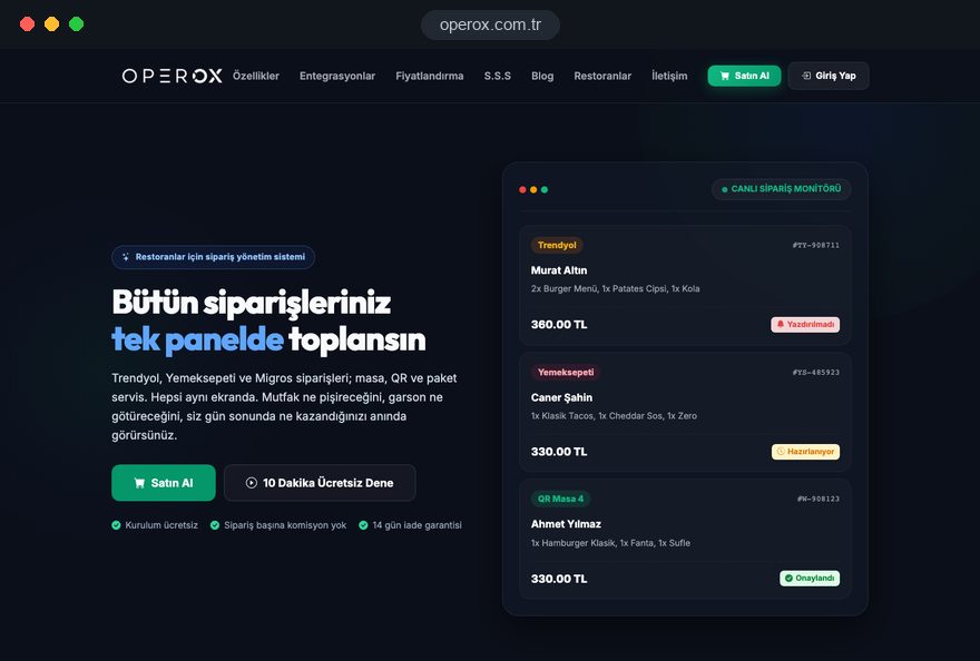
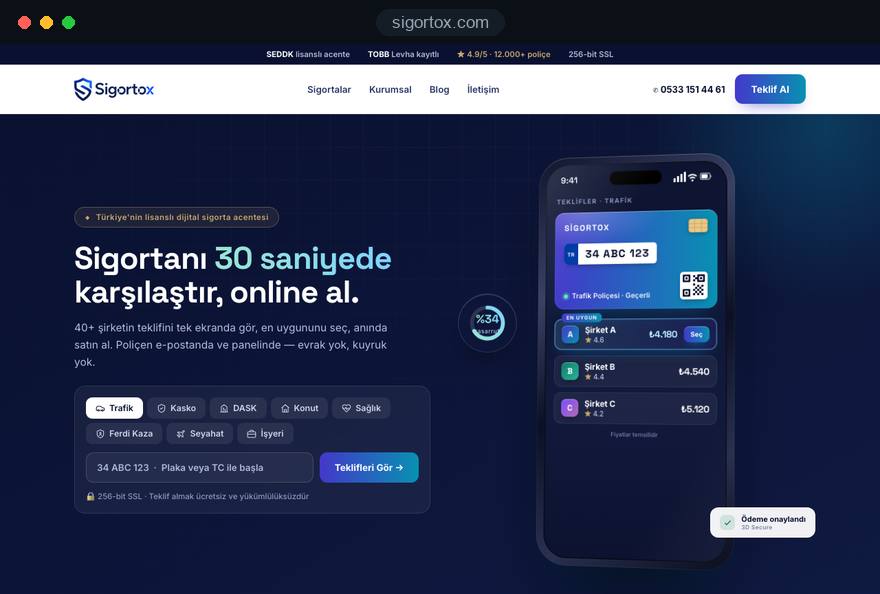
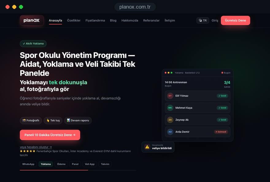
Our team built and runs Planox (management software for sports schools), Operox (restaurant order management) and Sigortox (an online insurance comparison platform), and we designed their marketing sites as well; all three are live and in daily use. Our advice on plan tables, trial signup and quote flows comes from decisions we make on these products. You can see more of our work on the references page.
Fixed price packages and online purchase are listed in the pricing section of our web design page. Tell us about your product, your plans and your target buyers, and we will work out a trial or demo led page structure and a written quote with you; you can book a free 15 minute call through our contact form.
Start a Project
Thanks {name}, we've received your brief. We usually reply within the same day.
What happens next?