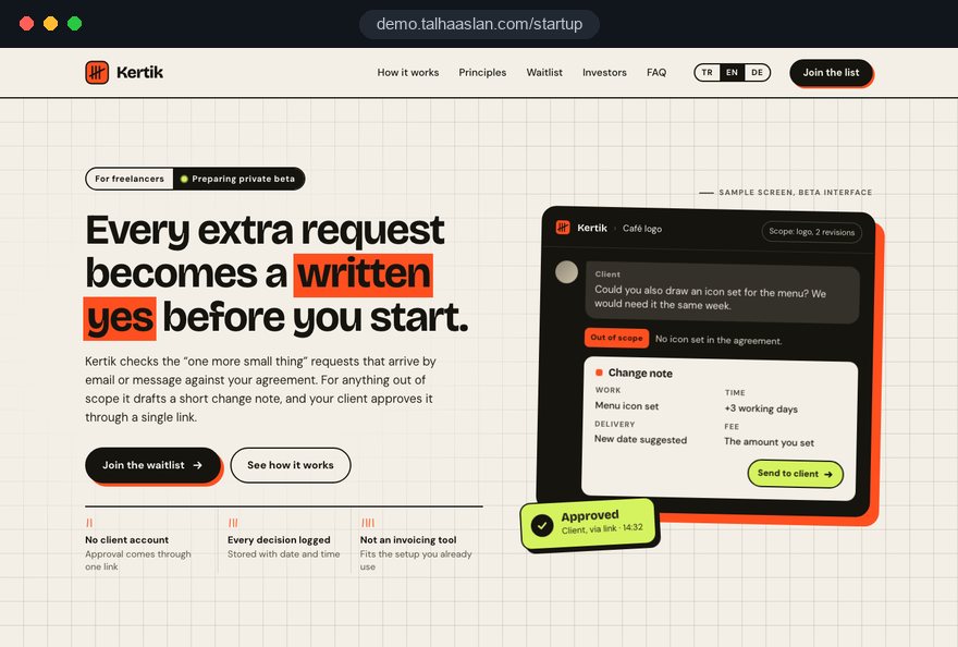
A homepage that says everything
Founders put every capability of the product on the first screen. If visitors cannot tell within seconds whose problem you solve, they leave, and you never learn which message failed.

Your Windows contrast theme is on; colours come from your system.
Your device is set to reduce motion; animations are already off.
Your choices are saved in this browser only.
Industry-specific web design
An early-stage startup website is not a finished company brochure; it is an experiment. It shows which message lands, who joins the waitlist and what investors want to know. That is why we build startup websites around one clear promise, an honest MVP showcase, a waitlist and an investor page, in a way the founding team can change on its own.
Open the live demoA demo design we built for a fictional brand
In short
A startup website explains one clear promise before the product is mature, shows the MVP with real screens, collects a waitlist and gives investors a tidy page, and it can change every week. The goal is not a large company site but learning which message and which audience respond. Once the product takes payments, the site grows pricing and feature pages.
Talha Aslan and teamLast updated:
Why it needs its own approach
Before product market fit, a website's first job is learning, not selling. Templates made for established companies do not take on that job.
Founders put every capability of the product on the first screen. If visitors cannot tell within seconds whose problem you solve, they leave, and you never learn which message failed.
The MVP is still in closed beta, yet the site shows a Get started button that leads to an empty page or a generic contact form. Interest is there, but nothing catches it.
Sign-ups pile up in a form tool with no record of the channel or message that brought them. On launch day there is no segment and no record of consent to email them.
After a first meeting, investors look at the site for the team, the problem and the traction. If that is scattered, or lives only in a deck attached to an email, the first impression suffers.
A team that wants to run weekly experiments waits for an agency or a developer to change one headline. As iteration slows, the site falls behind the real product.
The headline changed, but did sign-ups go up? Without tracking by source, page and button, the site stops being a learning tool.
Sources: Financial Services and Markets Act 2000, section 21, legislation.gov.uk
Our approach
We build an early-stage site so it still holds up while the product keeps changing: one sentence on the first screen saying whose problem you solve, real MVP screens underneath, and one action at the end. If the product is not ready, that action is the waitlist; in closed beta, it is an early access application.
To test different messages, we add ad-matched landing page variants without touching the main site; if you are aiming at other markets or international investors, we plan a multilingual structure from the start. When the product starts taking payments, the site grows into a SaaS website with pricing, feature and integration pages.
Design, development and content sit in one team. Talha Aslan sets the strategy and an experienced team handles delivery, fully remotely and in English for founders abroad. After handover, the founding team can update headlines, screenshots and team details on its own.
Home
Every section leads to one action: visitors who get the product join the waitlist, investors request the deck.
The right setup
All three start from the same foundation; the stage of the product makes the difference.
Pre-product
There is no product yet; the site tests a promise and measures interest.
MVP and beta
The product works but is closed; the site selects the first users and gathers feedback.
Fundraising
After a meeting, investors check the site; team, problem and traction sit in one place.
Built for startups
These are the points an early-stage team has to decide on when planning its site.
A headline that says who you help, with which problem and how, followed by one action. If you serve several audiences, each gets its own page and the homepage keeps a single message.
Real product screens instead of imagined mockups, a short demo video and a three-step explanation of how it works. Features that do not exist yet are not shown as if they did; the roadmap stays separate.
The sign-up form stores the source, the campaign and the use case each person picked. A consent checkbox and a privacy notice sit inside the form, so the list can be emailed at launch within the rules that apply to you.
Team, problem, market, traction and milestones on one page; the deck is shared through a request form rather than publicly. In the UK, section 21 of the Financial Services and Markets Act 2000 restricts communicating an invitation or inducement to engage in investment activity in the course of business unless an authorised person makes or approves it, so we keep the page informative and leave the legal check to your adviser.
Headlines, screenshots, team and changelog are edited from an admin panel; testing a new message does not have to wait for a developer.
Every sign-up and deck request is tracked as a conversion with its source, and separate variant pages can be set up for A/B tests. Which message works becomes visible in data, not guesswork.
Sources: Financial Services and Markets Act 2000, section 21 (restrictions on financial promotion)
Comparison
| Topic | Off-the-shelf company template | Site built for a startup |
|---|---|---|
| Message | About us, services and vision paragraphs | One sentence promise and one action on the first screen |
| Product | Stock photos and generic icons | Real MVP screens and a short demo |
| Sign-ups | A general contact form | A waitlist with recorded source and consent |
| Investors | No page of their own, the deck sits in an email | Team, traction and deck request on one page |
| Changes | Every headline waits for a developer | The founding team edits from the panel |
| Measurement | Visitor numbers | Which message and channel bring sign-ups |
Quick check
Must haves: does your site have them?
0 of 6 in place Tick the boxes to see where your site stands.
Added as needed
We choose which of these you need together during the scoping call.
Tell us where the product stands, who you are targeting and what the next few months should achieve; we will come back with a page structure and a written quote.
Process
We define your business, your audience and the site’s one-sentence job: who it sells what to, through which action. Scope and timeline are written from that answer.
The home page and key templates come to you as designs first; no code is written before your approval. We do not like surprises, and we do not cause them.
The approved design becomes fast, secure, maintainable code. You follow progress in the CRM and see every page in a staging environment before launch.
The site goes live with analytics, Search Console and conversion tracking connected; panel training is given, first-year hosting and maintenance included.
Search and speed foundations
At an early stage, a large share of visits comes from people who heard your name in a pitch, an article or on social media. Home, team and investor pages are built to appear in a sensible order for a brand search.
Company name, logo, founders and social profiles are marked up for search engines; nothing is marked up that is not on the page.
Pages are designed for phones first and Core Web Vitals are measured before launch; Open Graph tags are set so shared links show the right title and image.
UTM-tagged links are prepared for every channel, and waitlist sign-ups and deck requests are tracked as conversions from day one.
Free tools
Before launch, check your headline, your tracking and your brand name. The tools are free and need no sign up.
Content
Score your headline on length, word balance, power and emotional words, type and sentiment, with Google and inbox previews.
Conversion
Check whether your A/B test result is statistically significant and calculate the sample size and test duration you need.
Conversion
Calculate conversion rate, CPA and revenue per visitor, and plan how much traffic you need to hit your goal.
Analytics
Build correctly tagged links with Google Ads, social and newsletter presets.
Sharing
Preview how your link looks on WhatsApp, Facebook, X, LinkedIn and Telegram, and find missing Open Graph tags and image problems.
Trademark
Prepare trademark searches for the US, UK, EU, Australia, Canada, India, Germany and Turkey, flag absolute grounds and score similar marks you import with a transparent method and a report.
How we work
We do not have a live client project in this field yet, so we show our approach on a live demo site built by our team. The demo is not a client site. You can see our work in other sectors on the references page.
Live demo
For this field we built a one page demo site for a fictional brand, made only to show our approach. You can explore the design, the copy structure and the mobile view live in three languages.
Open the live demoBefore any design, we work with you to reduce whose problem you solve to a single sentence and build the page structure around it.
We do not describe features that do not exist yet; real MVP screens and the roadmap are shown separately.
Waitlist sign-ups, beta applications and deck requests are tracked with their source, and we read the results of each experiment with you.
After handover, you change headlines, screenshots and team details yourself; when the audience shifts, we replan the structure together.
Related pages
Industries
The next step once the product takes payments: pricing, features and trial sign-up.
Solutions
Single-goal variant pages for testing messages with ads.
Solutions
Pages per language for startups aiming at other markets or international investors.
Solutions
A members area where beta users log in and see content.
 What Should a Startup Website Look Like? A Guide to Winning Investors and CustomersRead article
 What Is Product Positioning? A Step-by-Step Framework and ExampleRead article
 Lead Form Design for Booking, Quote and Demo Requests: UX Rules That Lift ConversionsRead article
 What Is a Conversion Funnel? How to Build One for Your WebsiteRead article
FAQ
If your question is not here, write to us; we will send you an answer and a written quote.
Next step
In a free 15-minute call, in English, we will go through your product stage, your audience and your goals for the coming months, then send a written scope and quote.
In-depth guide
Until a startup finds product market fit, its website is less a marketing asset than an instrument. It tells you which sentence earns a signup, which audience comes back and what an investor checks after a first call, so the decisions behind it follow a different order from those behind an ordinary company site.
This guide walks through the questions we work through with founding teams, in the order they come up: defining the stage, testing the promise, running experiments on thin traffic, early channels, the waitlist data model, the path into beta, investor visits, trust, speed, brand search, ownership, common mistakes and choosing a partner. Each section ends in something you can act on this week.
The page list of a startup website should be derived from the product's stage and the one thing you need to learn at that stage. At the idea stage the question is whether people with this problem exist and will leave an email address. In beta it is whether the right people apply. During a raise it is whether someone who visits after a meeting leaves reassured.
Teams that skip turning that question into a single number end up with a site that does a bit of everything and measures nothing. In the first workshop we put these four lines in writing:
This framework also shortens every later debate about adding one more homepage section. If the new section does not serve the primary metric, it goes on its own page or does not ship. Keeping the site lean is not a style choice; it is what keeps the data readable.
The headline on the first screen should come from how your target user describes the problem, not from how the founders describe the product. Keep notes of the exact phrases people use in discovery calls; "stop matching invoices by hand at month end" usually lands faster than "finance automation platform".
A short sanity check before anything goes live cuts down the number of expensive experiments later. This is the sequence we use:
This check is not a statistical test, and five people do not represent a market; its job is to catch sentences that get misread. The real comparison happens with the experiment setup described in the next section. The subheadline should not repeat the promise; it should answer the most common objection, such as setup time, fit with existing tools or where the data lives.
With low visitor numbers, pushing every change through a classic A/B test rarely produces an answer, so early experiments have to be built on big differences and read alongside qualitative feedback.
Compare two entirely different promises or two different audiences instead. Pitching the same product as "for finance teams" on one page and "for founders" on another can show a meaningful gap even with modest traffic. Checking whether a variant is really ahead with our A/B test calculator keeps you from mistaking noise for a win.
When the numbers are too small, one open question on the thank you page is often the fastest way to learn. Asking "how do you solve this today" reveals competing tools and, indirectly, willingness to pay.
Before search engines send steady traffic, a startup's visitors mostly arrive through the founders' own channels, so tagging every channel separately is a day one job. Without it, the community, post or ad behind each signup stays a guess.
The weighting differs for every startup, but the typical early channels are the founders' professional networks, niche communities and forums, talks at events, mentions in newsletters and small test ad budgets. Build a separate link for each with our UTM builder; let utm_source name the channel and utm_campaign name the message you are testing.
If you want to test messages with ads, a separate page that mirrors the ad copy keeps the homepage data clean. That is what our single goal landing page variants are for, and the campaigns themselves can be planned under our Google Ads management. The goal at this point is learning, not revenue: finding out which search phrase or which audience leaves an address.
A waitlist form is not a box that collects emails; it is the data structure that decides what you can say to whom on launch day. Pick the fields by imagining the launch email first, then design the form.
Email marketing rules differ between the US, the UK and the EU, and a startup often launches into more than one of them. Recording explicit consent inside the form, next to a short privacy notice, keeps the list usable wherever you launch; your counsel can confirm the wording for your markets. For visitors in the European Economic Area, Google also requires consent mode for its measurement and personalized advertising features, so the cookie banner and the analytics setup have to be planned together.
Where the list lives matters as well. A startup list tends to drift between several tools, so pick one source of truth and sync signups automatically to your email tool or CRM; then send one test record end to end before launch.
Your first real contact with a waitlist subscriber happens on the screen right after they sign up, and a bare "thanks" wastes the warmest moment the list will ever have. Drawing the whole path from signup to beta invite as one flow prevents a scramble of improvised emails at launch.
A referral queue where people move up by sharing can grow the list, but the rules need to be fair and stated openly. A queue that moves by hidden logic damages trust with exactly the users you need most. Before adding referrals, we make sure referred signups are tracked as their own source, so you can judge their quality separately from everyone else.
The rule for presenting an MVP is simple: visitors must be able to tell what works today from what is coming later.
When you use real screenshots, fill them with realistic sample data; real customer names or personal data should never appear on screen. A short demo video explains more than still images, but it must not slow the page down. Load a poster image first and play the video only on click.
If you do not have user quotes yet, do not invent them. Add real feedback from beta users, with their permission, their name and a line of context. Showing a company logo under "trusted by" without permission puts both trust and the relationship at risk.
Investors usually reach the site after an intro or a first call, for a quick check; the page's job is not to persuade but to confirm what they heard in a consistent way. So the investor page should be a summary of the deck and the door to it, not a copy.
Team, the problem you solve, a definition of the target market, progress to date and the next milestones are enough. Detailed financials, contracts and user metrics belong in a data room shared on request, not on the public site. Adding two fields to the deck request form, fund name and meeting context, shows you who is actually reviewing.
If you raise from UK investors, note that section 21 of the Financial Services and Markets Act 2000 restricts communicating an invitation or inducement to engage in investment activity in the course of business unless an authorised person makes or approves it. Keeping the page informative and having your adviser review any wording about the round reduces that risk from the start.
At an early stage, trust comes from visible people and a visible company, not from customer logos. If a visitor cannot answer "who is behind this, is it a real company, is my data safe", even a strong promise will not turn into a signup. These are the elements we keep on the site from the first version:
If you are part of an accelerator, a grant program or an incubator, name it accurately; never present a program you only applied to as one you were accepted into. If you run pilots, a truthful, measured line such as "two pilot teams in logistics" builds more confidence than an inflated logo strip.
Startup links are mostly opened on phones, from messaging apps and social feeds, so the first impression is made by how fast the page loads on mobile and how it looks when shared. Speed and previews belong in the first page template, not in a fix after design is done.
Google's Core Web Vitals "good" thresholds, measured at the 75th percentile of visits, are: LCP, which measures when the largest content element finishes loading, at 2.5 seconds or less; INP, which measures how quickly the page responds to interaction, at 200 milliseconds or less; and CLS, which measures visual stability, at 0.1 or less. Early sites usually break these with heavy hero videos, uncompressed product screenshots and tracking scripts added without review.
Do not treat measurement as a one time check. Every new variant page or tracking script can shift these values, so measure the homepage and the busiest variant on a phone again after each major change.
In the early months, most search traffic comes from people who heard the startup's name somewhere and typed it in, so the first SEO goal is not broad keywords but showing up cleanly and completely for your own name. A search for the name should return the homepage, team and investor pages with sensible titles and descriptions.
Investing heavily in content marketing before the product direction settles is usually premature; when the audience changes, the articles become dead weight. Start instead with pages that answer the two or three questions users raise most often in calls. Once the product settles, a full SEO program makes sense. If you plan to enter other markets, setting up language versions and reciprocal hreflang annotations from the start is far less work than migrating later.
The main test for a startup website's stack is how quickly the founding team can change a headline or a screenshot without waiting for a developer. The second is whether the site can grow into a paid product site without a rebuild.
Drag and drop builders are fast in week one, but they hit their limits as variant pages, hidden form fields and measurement grow. A fully custom site with no admin panel ties every edit to a developer. We build something in between: design and components stay with us, while copy, images, team details and the changelog live in the founders' panel.
Ownership matters as much as the stack. Make sure these accounts are opened in the company's name:
To avoid losing access when a cofounder leaves or you switch agencies, at least two people should hold admin rights everywhere. We hand over our web design service with these ownership rules in place, so the site can grow alongside the product.
Most mistakes on early sites are about sequence, not design: experiments run before measurement exists, product language appears before the product does. These are the six we run into most often in planning sessions with founding teams, each with what to do instead.
What these have in common is that fixing each one later costs more than setting it up correctly at the start.
The right partner for a startup is not a team that hands over a site and disappears, but one that can read the first experiment results with you and change the structure as the product changes. We suggest asking every agency you speak to these questions:
A team that cannot answer these with concrete examples will most likely deliver your site once and walk away. Asking for written answers also makes proposals easier to compare on the same terms.
To see our approach in this field, look at the live demo linked on this page; it is a sample built by our team, not a client site. For work in other industries, see our client references. You can review the fixed scope packages in our pricing section, and for a written scope and quote matched to your stage, get in touch with us.
Bring a short note on where the product stands, the first user type you target and your primary metric; a deck or interview notes help too, so the promise on your startup site starts from your own evidence.
Start a Project
Thanks {name}, we've received your brief. We usually reply within the same day.
What happens next?