A care home website is usually opened late at night, on a phone, by a son or daughter who has just been told their parent cannot go home from the hospital. They have a handful of hard questions and siblings waiting for answers. The same site has to be calm enough for the future resident to read, and careful enough not to put the people who live there today on display.
In this guide, Talha Aslan and team set out the decisions we make, in order, when planning a website for a residential home, a nursing home or a home care agency. The regulatory notes refer mainly to England and are general information; your care content and the final compliance check always belong to you.
01Three readers with three different questions
The first design decision for a care home website is to separate its readers, because each arrives with a different question. A site written in one voice for everyone answers nobody well.
- The adult child deciding: wants to know which type of care fits, who is on at night and when they can visit; scans headings rather than reading paragraphs.
- The future resident: wants to see the room, the garden, the food and what a day feels like; needs large type and a quiet tone.
- The referring professional: a hospital discharge coordinator or social worker who needs admission criteria and a named contact within seconds.
- The sibling far away: lives in another city or abroad, shares the decision and receives the site as a link in a family chat.
This split shapes the navigation. The home page offers the adult child a "which care is right" route, the resident an "a day here" route, and professionals a short path to admission criteria. Since the distant sibling lands on whatever page was shared, every page must make sense on its own.
In our first call we ask one question: who were the last ten callers, and what did each ask first? The answer shows which reader comes first.
02Care type pages that say who each one suits
Each type of care deserves its own page that says plainly who it suits and who it does not. Residential care, nursing care, dementia care, respite stays and home care are different decisions, and a single list of services forces families to work out the difference on the phone.
A nursing or dementia care page can follow this structure:
- Who this care is for, described through real situations: advanced dementia, needing two carers to move, needing nursing input day and night.
- When another setting may be more suitable, for example needs your home cannot safely meet.
- How the care plan is written, who contributes and how often it is reviewed.
- A short summary of a day in this unit, linking to the daily life page.
- What moving in involves and how the assessment works.
The second point is missing from most sites, yet it builds more trust than anything else. A home that names its limits shows it takes the decision seriously.
Respite deserves its own page too. A family looking for a few weeks of recovery after a hospital stay will not find their answer on a permanent placement page; they need the shortest and longest stay, how a room is reserved and whether a respite stay can become permanent.
Every care type page ends with the same sentence: suitability is confirmed at an assessment by the home's team. It sets the right expectation and keeps the site from reading like a diagnosis.
03Showing your CQC rating, registration and team
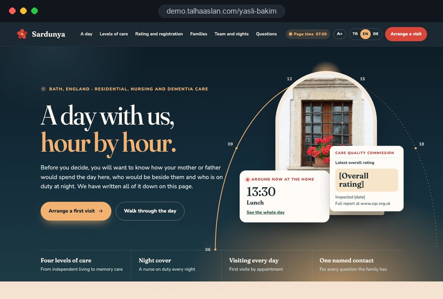
The page about your home should carry checkable facts rather than slogans, and in England the first of those facts is the CQC rating. Regulation 20A requires every website maintained by or for a CQC registered provider that has received a rating to show the most recent rating, legibly and conspicuously, together with where the latest report can be found and the CQC website address. A newly registered home without a rating yet should say so plainly rather than leave a gap.
We recommend this page includes:
- Rating block: the latest rating with its date, the services or location it covers and a link to the full report, visible without scrolling on the home page as well.
- Registration: the provider name and the regulated activities you are registered for; carrying on a regulated activity without registration is an offence under section 10 of the Health and Social Care Act 2008.
- Registered manager: name, role and, with their agreement, a photo.
- Team roles: nurses, carers, activity staff and kitchen team described by role and shift pattern rather than a long list of names.
- Night cover: who is on duty overnight and at weekends, and how a nurse or senior carer is reached.
The rating block needs an owner. When a new report is published, someone on your team should know the website must change the same week; an outdated rating looks worse than a modest current one. Outside England, Scotland, Wales and Northern Ireland each have their own regulator and rules, so we check your regulator's requirements before launch.
04A day, hour by hour, without identifying anyone
The daily life page is where a family can picture their relative living with you, so it should be written in times, not adjectives. "A warm, homely atmosphere" says nothing; "breakfast from 8:30, in the dining room or your own room" says a lot.
When we prepare this page, we ask your team for:
- Waking, meal and snack times, and how special diets and texture modified food are handled.
- How medication rounds work and who carries them out; the process, never individual medicines.
- Weekly activities, garden access and outings, and how faith and cultural needs are supported.
- Quiet time, and which parts of the day are left to the resident's own choice.
That last point matters more than it seems. Families worry that their parent will be pushed into a fixed program, and one sentence such as "joining activities is always optional" reassures more than a page of photos.
For images we use real photos of the home: an empty, laid dining room, the garden in morning light, an activity table seen from above. Hands, or a group seen from behind, show life without making anyone identifiable.
If you publish a weekly menu or activity plan, decide in advance who updates it. A menu from three weeks ago leaves a worse impression than no menu at all.
05A written image policy that protects residents
Decisions about resident photos belong in a written policy made while the site is planned, not on the day someone brings a camera. Where a resident's capacity to consent may be reduced, even a birthday photo shared in good faith can become a real privacy problem. Under UK GDPR, data concerning health is special category data, and an image taken in a care setting can reveal a health condition.
The workflow we set up with care homes:
- Default rule: the site shows the home, not identifiable residents.
- If a resident's image is needed, clear and recorded consent is obtained, or the agreement of someone legally able to decide for them where capacity is reduced.
- The consent record names the image and each channel separately, the website and each social media account.
- Images that show a bedroom, a name, medical equipment or a visible condition are never published.
- When consent is withdrawn or a resident leaves, a named person removes the image within an agreed time.
The policy itself can be summarized in a short paragraph on the site. When a family sees that the people living there today are protected, they conclude that their own relative will be protected tomorrow.
06Writing the visiting and family updates page
The page for families describes life after moving in and answers their biggest worry: how will I know how Mum is doing. When it is missing, families raise the question at the visit, but many have already decided by then.
The page should answer:
- Visiting: visiting hours, whether visits need booking, and arrangements for holidays and special occasions.
- Updates: who contacts the family, how often, through which channel, and which events trigger a call the same day.
- A single contact: how the home handles several siblings, and who the main family contact is.
- Hospital admissions: what happens in an emergency and when the family is told.
- Video calls: whether relatives far away can arrange them, and how.
We write the routine your home actually follows, not an ideal one. A site that promises daily updates the team cannot deliver loses trust within the first month; "we call every week and the same day if anything changes" is a promise you can keep.
A printable summary helps relatives who live far away. Visiting hours and the main contact on one page end up on a fridge door or forwarded to the rest of the family.
07Moving in, step by step, with a document list
The moving in page shows a family that has decided, or nearly decided, exactly what happens next; an unclear process delays even a decision that has been made. Families are often working against a hospital discharge date, so the order of steps and what each one requires must be obvious.
A typical sequence can be described like this:
- A first visit or phone call.
- The assessment, where health and care needs are discussed in person.
- Paperwork and information the home needs before admission.
- The contract and planning the moving in day.
- How the first week runs and how the family is updated during it.
We take the document list from your current practice and present it as a printable checklist. The "what to bring" list belongs here as well: labeled clothing, favorite photos, glasses and hearing aids, the small items that make a room feel like home.
Families will also ask about fees on this page. If you prefer not to publish figures, explain what the fee depends on, how funding routes are discussed at the assessment and that a written quote follows.
08The visit request form: fewer, better questions
The visit request form should be short and should not ask for health information; detail belongs at the assessment, in a protected setting. Diagnoses, medication and hospital letters collected in a web form create a special category data risk and make families abandon the form halfway.
The fields we recommend:
- Name, phone number and relationship to the person needing care.
- The type of care of interest: residential, nursing, dementia, respite or home care.
- Preferred days and times for a first visit.
- A short notes field, with one line asking people not to include medical details.
A link to the privacy notice sits right under the form. Next to it, a click to call button serves people who prefer to talk, and a WhatsApp link serves those who prefer to message.
Several siblings often inquire about the same parent. That is why we collect requests in one list, each with the care type and the page it came from; your team does not treat the second sibling as a new family, and whoever calls back already knows the context.
09What changes for a home care agency
For domiciliary care, the website describes people rather than a building; families want to know why they should trust the person who will let themselves into their parent's home. In England, providing personal care is a regulated activity, so your registration and CQC rating carry the same weight here as for a care home.
Pages or sections we plan for a home care site:
- Areas covered: the towns and postcodes you serve, listed clearly, and what you do when an inquiry falls outside them.
- Visit patterns: short calls, longer daytime support, overnight care or live in care, only the ones you actually provide.
- Recruiting and matching: how carers are recruited and trained and how they are matched with a client.
- The first home visit: who comes, what they look at and how the care plan is written.
- Continuity: how you handle holidays, sickness or a match that does not work.
Some families arrange care for parents from another country, and some homes serve residents whose first language is not English. If a second language is needed, we plan the multilingual site structure from the start; a language added later leaves gaps in menus and forms.
10Readability for older readers and tired families
On a care home website, readability is a core design criterion rather than an accessibility extra: some readers have sight loss, and others are exhausted relatives reading on a phone at midnight. We tie design decisions to measurable checks:
- Contrast: WCAG 2.2 level AA asks for a contrast ratio of at least 4.5:1 for normal text; we test every color pair with a color contrast checker before launch.
- Type size: body text comfortably readable on a phone, generous line spacing and no thin fonts.
- Language: short sentences and familiar words; a readability checker flags long, dense paragraphs.
- Touch targets: call and WhatsApp buttons large enough for an unsteady finger.
- Speed: Core Web Vitals targets of 2.5 seconds or less for LCP, which measures when the main content appears, and 200 milliseconds or less for INP, which measures how quickly the page responds.
You can see how your current site behaves on a phone right now with a mobile friendly test. Extras such as a virtual tour or heavy video belong on their own page and load only on request, so the home page stays light.
11Local search, Business Profile and structured data
Families search for a care home by town or district, close to their own home or to the hospital, so local visibility matters as much as the rest of the site. The steps we take:
- Each care type has its own page and title, so searches for a nursing home, dementia care or home care land on the right page.
- The name on your Google Business Profile matches your real world name with no added keywords; stuffing the name puts the profile itself at risk.
- The contact page covers address, directions, parking and public transport, because families plan visits around them.
- Home name, address, phone and visiting information are marked up as structured data; nothing is marked up that the page does not show.
- A home care agency that does not receive clients at its office can set up the profile as a service area business and hide its address.
Replying to reviews needs particular care in this field. Naming a resident, mentioning a health condition or describing an incident in a public reply is a privacy breach; replies stay short and courteous, without detail, and offer a phone call where needed.
Our SEO service turns these steps into a plan for your area, and in the first months we track together which care type searches you appear for.
12Measuring which care type pages bring visits
The point of measurement is not visitor numbers but seeing which page turns into a visit request. That tells you when to stop investing in a unit that is nearly full and when to strengthen the page for a unit with rooms available.
The setup we build:
- Form submissions, click to call and WhatsApp clicks are tracked as separate conversions.
- Each request is stored with the page it came from and the care type selected.
- Your team marks which requests led to an assessment and which to a move in, so the page that brings the most requests can be compared with the page that brings the most residents.
- The cookie banner and consent settings are in place before any tracking code fires.
There is one firm boundary: no health information ever reaches analytics tools. Form contents, residents' names and notes about care needs are never passed on; only an event such as "visit request from the dementia care page" is recorded.
Once a month we review a short report with you, and when staffing, visiting hours or care types change, we update the site in the same meeting.
13Six common mistakes on care home websites
Most mistakes in this field come not from bad intentions but from applying a generic business template to a sensitive service. The ones we see most often, with the better alternative:
- A gallery full of residents' faces: it looks lively but creates a consent problem; use photos of the home and people who cannot be identified.
- All services on one page: families cannot tell what fits; give each care type its own page that says who it is for.
- A missing or outdated CQC rating: it is a legal display duty and the first thing many families check; show the current rating with its date and a link to the report.
- Diagnosis questions in the form: they create data risk and abandoned forms; leave health details for the assessment.
- Promises the team cannot keep: "daily updates" that never happen end trust within a month; describe the routine you actually follow.
- Stale content: a nurse who left last year or last month's menu makes the home look neglected; give every page an owner and a review date.
14Choosing a partner and the next step
The right partner for a care home website is the one that puts publishing sensitive information accurately ahead of a striking design. We suggest asking any agency you speak to:
- Which consent workflow do you propose for resident photos, and what happens when consent is withdrawn?
- Which fields go in the form, and how do you keep health information out of it?
- Who updates the rating, staffing and visiting details when they change, and how quickly?
- How do you test readability and contrast before launch?
We do not yet have a live client project in elder care, so we show our approach on the live demo linked on this page. The demo is not a client site; it shows the structure we build. You can see our work in other sectors on the references page and the full scope of our web design service on its own page.
After the first call, the process is clear. We record your care types and registration details, agree the sitemap and image policy with you and draft texts from real family questions. No text about care, staffing or registration goes live without your written approval.
To prepare, list your care types, capacity, staffing pattern and the five questions families ask most. You can review fixed packages in our pricing section and request a short scoping call for a written quote through our contact page.