All routes in one list
Every airport, resort and hotel you serve is crammed into one paragraph. Travellers cannot tell whether their hotel's area is covered, and search engines find no page to show when someone searches for that route.

Your Windows contrast theme is on; colours come from your system.
Your device is set to reduce motion; animations are already off.
Your choices are saved in this browser only.
Industry-specific web design
Travellers looking for a transfer think in routes, not cars: from the airport to the hotel, from the hotel to the conference venue. We build airport transfer websites around a page for every route, a quote form that starts with where from, where to, how many passengers and how many cases, a flight number field and meet and greet details written in the traveller's own language. The car comes with a driver, so the site sells a door to door journey rather than a rental.
Open the live demoA demo design we built for a fictional brand
In short
An airport transfer website explains each airport, hotel and city route on its own page, asks travellers where they are going with how many people and cases, suggests the right vehicle and takes the flight number so pickup is clear. For chauffeur and private transfer firms the vehicle interior and driver come first; for airport work it is the meeting point and the delay policy. Confirmation with driver name and number plate goes out by WhatsApp or email.
Talha Aslan and teamLast updated:
Why it needs its own approach
A transfer decision comes down to the route, the number of passengers and the landing time. Generic templates ask for none of them, so the traveller messages another firm while waiting for your reply.
Every airport, resort and hotel you serve is crammed into one paragraph. Travellers cannot tell whether their hotel's area is covered, and search engines find no page to show when someone searches for that route.
There are photos of the vehicles but nothing about how many passengers and cases they take. A family of five, a group with golf bags or parents with a pushchair cannot choose the right vehicle, and the luggage does not fit at the kerb.
The form has no field for the flight number or landing time. Nobody knows whether the driver waits when the flight is late or what that costs, and travellers who land early cannot find their driver.
The site does not say where the driver waits, whether there is a name board or which exit to use. A first time visitor in a busy terminal does not know who to look for, so they book through a large platform they recognise.
Company name, licences held, vehicle insurance and driver experience appear nowhere. Someone about to get into a stranger's car after midnight will not prepay a firm that shows none of this.
Hotel receptions and travel agencies also send group transfers, but there is no separate way for them to do it. Requests from partners and individual travellers end up tangled in the same WhatsApp thread.
Our approach
We build a transfer website in the order travellers ask their questions: first they choose where from and where to, then they see the vehicles that suit their group and luggage, and finally they add their flight and, if needed, the return journey before sending the request. You set the fare for each route; the site shows it clearly on the route page and in the request step.
If you need instant confirmation and prepayment, we connect the route table to a reservation system; if most travellers arrive from abroad, we set up a multilingual structure from day one. A separate group request form for hotels and agencies runs alongside the individual flow without getting in its way.
Design, development and content sit in one team, so route, vehicle and pickup pages are not patched together later. Talha Aslan sets the strategy and an experienced team handles delivery. We work remotely and in English with transfer firms in the UK, Europe and Turkey.
Home
Each route answers its own search, and all of them lead into the same quote form, which asks for flight details from the start.
The right setup
All three start from the same foundation; who the traveller is and where the request comes from make the difference.
Airport transfers
Travellers book from another country while arranging their flights, so the site explains routes, pickup and the delay policy in their language.
Chauffeur service
The client is a travelling executive or someone planning a special day, so the site puts the vehicle interior, the driver and discretion first.
Hotels and agencies
Requests come from hotel receptions or travel agencies, so the site collects group and recurring transfers through a separate form.
Built for transfer companies
This list comes from the questions transfer firms answer most often by message and the details travellers want to see before they pay.
A separate page for each airport and area pairing: rough journey time, which vehicles run it and whether the fare is per person or per vehicle. We only create pages for routes you actually run.
Each vehicle shows how many passengers, large cases and cabin bags it takes; special needs such as a baby seat, a wheelchair or sports equipment are asked for separately in the form.
The form takes the flight number and landing time. The page states clearly where the driver waits with a name board, how long they wait after a delay and how the traveller reaches the driver.
Once a request is confirmed, the traveller receives the driver's name, phone number and number plate by WhatsApp or email. We set this step up manually or automatically to suit your workflow.
Show the licences you hold, such as an operator licence where your licensing authority requires one, along with your company name and insurance. Which licence applies depends on where and how you operate; we display what you have and leave that question to you and your licensing authority.
Under regulation 27(2)(c) of the UK Consumer Contracts Regulations 2013, the cancellation rights in Part 3 do not apply to passenger transport services. Your own cancellation and refund terms therefore decide, and we show them clearly before payment; the final legal check of your terms belongs to your business.
Sources: legislation.gov.uk: Consumer Contracts Regulations 2013, regulation 27(2)(c) · legislation.gov.uk: Consumer Contracts Regulations 2013, regulation 7(3)
Comparison
| Topic | Generic business template | Site built for transfers |
|---|---|---|
| Routes | One paragraph listing areas | A page for every airport and area |
| Request | Name, phone and message | From, to, passengers, cases and flight number |
| Vehicles | A photo gallery | Vehicle pages with passenger and luggage capacity |
| Pickup | Not explained | Meeting point, name board and delay policy |
| Partners | Same channel as individual travellers | A separate group request form for hotels and agencies |
| Measurement | Visitor numbers | Which route and which language bring requests |
Quick check
Must haves: does your site have them?
0 of 6 in place Tick the boxes to see where your site stands.
Added as needed
We choose which of these you need together during the scoping call.
Tell us which airports and areas you cover, which vehicles you run and where your travellers come from; we will come back with a page structure and a written quote.
Process
We define your business, your audience and the site’s one-sentence job: who it sells what to, through which action. Scope and timeline are written from that answer.
The home page and key templates come to you as designs first; no code is written before your approval. We do not like surprises, and we do not cause them.
The approved design becomes fast, secure, maintainable code. You follow progress in the CRM and see every page in a staging environment before launch.
The site goes live with analytics, Search Console and conversion tracking connected; panel training is given, first-year hosting and maintenance included.
Search and speed foundations
Travellers rarely search for a transfer on its own; they add the airport and their destination, often in their own language. Each route page answers one of these searches, and we never duplicate the same text with only the place name changed.
Business name, address, phone and service area are marked up so search engines can read them; nothing is marked up that is not on the page.
Many transfer requests are sent from a phone, sometimes just before boarding. Pages are designed for phone screens first, the form is kept short and Core Web Vitals are measured before launch.
Requests, calls and WhatsApp clicks are tracked as conversions from day one, so you can see which route, which language and which partner link bring business.
Free tools
Before planning a new site, see how your current one loads on a phone, whether its language settings work for visitors and whether the links you give hotels are tracked. The tools are free and need no sign up.
Tech SEO
Test whether a page works well on phones: viewport, font size, tap targets, a mobile screenshot and Core Web Vitals.
Tech SEO
Scan any URL for title, meta description, headings, canonical, indexability and speed signals, and get an SEO score with a clear to-do list.
Tech SEO
Correct hreflang tags for multilingual sites; x-default automatic.
Conversion
Create a wa.me link with a preset message + embeddable button code.
Analytics
Build correctly tagged links with Google Ads, social and newsletter presets.
Currency
Convert euros and 30 currencies with official ECB reference rates, look up any past date since 1999 and see monthly averages.
How we work
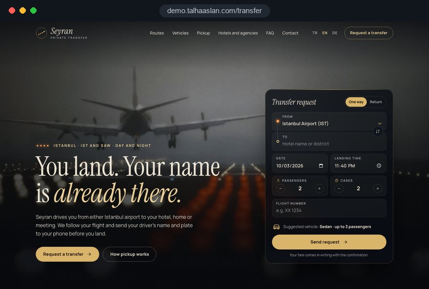
We do not have a live client project for a transfer company yet, so we show our approach on a live demo site. The demo is not a client site. You can see our work in other sectors on the references page.
Live demo
For this field we built a one page demo site for a fictional brand, made only to show our approach. You can explore the design, the copy structure and the mobile view live in three languages.
Open the live demoIn the first call we collect the questions travellers ask most often on WhatsApp; route pages, form fields and the meet and greet text come from that list.
We create pages only for airports and areas you serve regularly, each with journey time and vehicle details specific to that route.
Together with your team we pin down where the driver waits, what happens after a delay and how travellers reach the driver, then explain it plainly on the site.
We track which route and language bring requests and where people drop out of the form, and adjust before the busy season.
Related pages
Industries
A separate setup for firms that rent cars without a driver, built around the fleet and rental terms.
Industries
Dated tour pages for agencies that sell transfers as part of a package.
Solutions
The technical base for transfer requests with instant confirmation and prepayment.
Solutions
Route pages per language for travellers arriving from abroad.
 Lead Form Design for Booking, Quote and Demo Requests: UX Rules That Lift ConversionsRead article
 Multilingual Website SEO: How to Reach Global CustomersRead article
 How to Choose a Payment Gateway: What to Check Before You SignRead article
 What Is Mobile First Design? How Mobile First Affects Your SEO RankingsRead article
FAQ
If your question is not here, write to us; we will send you an answer and a written quote.
Next step
In a free 15-minute call, in English, we will go through your routes, vehicles and pickup arrangements, then send a written scope and quote.
In-depth guide
An airport transfer website has one job that a template rarely does: answer the questions your team otherwise answers by message at midnight. Do you cover my hotel, will five people and seven cases fit, what happens if my flight is late, where exactly will the driver be. When those answers are missing, the traveler books through a large platform that shows them up front.
We wrote this guide in the order transfer company owners actually make decisions on a website project. Each section gives you a step to apply with your team, a question to ask your agency or a check to run before launch.
The first decision that shapes the site is where most of your bookings come from. A tourist landing at the airport, an assistant booking a chauffeur by the hour for an executive and a hotel front desk asking for vehicles for a fifty person conference do not start with the same question, so they should not land on the same first screen.
If you do all three, put one on the home page and give the others their own entry point. Base the choice on last season's records rather than instinct:
These four answers form the core of the first call in our web design service. If more than half your work comes from hotels, for example, the first screen may need two equal paths, one for travelers and one for partners, rather than a single booking widget. Settling this before talking about colors and logos saves weeks on a transfer company site.
Each route page should answer one question clearly: do you serve the area I am going to from this airport, and how does it work. That means the page carries information specific to that journey, not just a swapped place name.
A useful route page includes:
Let the routes you genuinely run decide the number of pages. Twenty copies that only change the destination name count as thin content for search engines and tell the traveler nothing new. A simple rule: if you cannot write at least three facts specific to a route, do not give it a page; mention the area on a parent page instead. Starting with the three airport transfer routes that bring the most work is also a realistic way to be ready before the season.
Hourly chauffeur work and long distance transfers follow the same logic with a different question. For hourly bookings the traveler thinks in time, not routes, so the page should explain the minimum booking period, how the driver's hours work and how trips outside the city are handled.
A transfer request form gets completed when it follows the order already in the traveler's head: where from and where to, then how many people and cases, and only then personal details. A form that opens with name and phone asks for something before it gives anything, and people abandon it halfway.
The order we use:
On a phone, a stepped form with two or three fields per screen is easier to finish than one long page. Keep required fields to what you actually need; if you do not need a passport number to meet someone, do not ask for it. Before launch, have someone on your team complete the form one handed on a phone in under a minute.
End the form by telling the traveler what happens next: how soon you reply, which channel the confirmation comes through and whom to call if it does not arrive. Those three sentences stop the same person from messaging you again five minutes later.
The biggest worry in any airport transfer is a late or early landing, and a company that writes its rule on the site stops answering that question for every booking. The form collects the flight number and scheduled landing time; the page explains what you do with them.
Rules worth putting in writing:
If you want an automated flight status integration, we scope it as a separate item; for many firms it is enough that drivers check the status themselves using the flight number. What matters most is that the rule your drivers follow on the ground matches the rule on the site. Decide before launch who updates the page when the rule changes, because travelers will reasonably hold you to an outdated waiting time.
A vehicle page exists to answer "will our group fit in this," and a glossy photo alone does not do that. For each vehicle, show passengers, large cases and cabin bags together, and say what happens when both are at full capacity.
Checklist for vehicle pages:
If you sell a chauffeur service to companies, the vehicle page should also cover driver dress code, your approach to confidentiality and invoicing. These clients look at how organized you are before they look at the fare.
Showing a vehicle class instead of a model name is a sensible option: "executive minivan, up to six passengers and six large cases." When the fleet changes, the page does not make a false promise. Once the capacity table is linked to the form, it stops suggesting a vehicle that cannot take the passengers and cases entered, so no one meets a case that will not fit.
The meet and greet page has to be detailed enough for someone who has never been to this airport and does not speak the language to find their driver. "Our driver will meet you" is useless in a crowded arrivals hall; the traveler needs to know where to walk and whom to look for.
For each airport, write the pickup as steps:
Write this text with your drivers. They know where travelers usually get lost and which sign makes them easier to find. If you can, add your own photo of the meeting point and the name board. Send a short link to the same instructions in the confirmation message, and travelers will open it on their phone right after landing.
Hotel and address pickups need a similar note: whether the driver waits in the lobby or at the entrance, and how many minutes early the vehicle arrives.
After sending a request, the traveler expects a clear confirmation with the driver's name, phone number and number plate. How fast and how consistently that arrives builds as much trust as the site itself, and whether you send it manually or automatically depends on who plans your fleet.
Criteria for the choice:
If you need instant confirmation and payment, a booking system connects to the route table. Whichever path you choose, we write the confirmation template with you: date, time, meeting point, driver details and a short link to your cancellation terms. A reminder sent the day before the trip catches wrong dates and times while there is still time to fix them.
When partner requests share a form with individual travelers, both your team and the partner lose time. A hotel front desk does not want to enter guests one by one; it needs a separate form that takes a passenger list and recurring transfer details.
Fields that work in a partner form:
Giving each hotel or agency its own trackable link is the simplest way to see which partner sends how many requests; you can build those links with our free UTM builder. A separate partner page in the menu also keeps the traveler's path simpler. Use it to explain how you work, which areas you can serve at which hours and how quickly you reply to group requests.
A traveler about to get into a stranger's car in an unfamiliar city at midnight wants proof, before paying, that a real and properly licensed company is behind the site. Those signals belong next to the booking step, not buried in a footer page.
Show the licenses you hold, such as an operator license where your licensing authority requires one, together with your registered company name and insurance. Which license applies depends on where and how you operate; we display what you have, and that question stays between you and your licensing authority.
Checklist for legal and trust pages:
The final legal check of your terms belongs to your business; we make them readable and put them where people see them.
Travelers from abroad usually book a transfer while planning the trip, from home and in their own language, so language structure is a starting decision rather than a later add on. Let the country mix in your booking records decide which languages to open.
What to watch on language versions:
Each language version should reference the others and itself with hreflang; without these reciprocal annotations, search engines struggle to show the right language to the right country. We explain the setup and content plan per language on our multilingual website page. For visitors from the European Economic Area, cookie consent has to be in place before any non essential tracking starts.
Match the number of languages to your capacity. Every language needs someone to keep it current; if a fare or waiting rule changes in English but stays old in Russian, the Russian speaking traveler pays for it. Two well kept languages bring more bookings than five half finished ones.
Travelers searching for a transfer usually type the airport name and their destination together, and the way to appear for those searches is a page that genuinely answers that route. A generic "private transfer" page is not enough for someone looking for a specific journey.
Practical steps for search visibility:
Reviews also influence map visibility; a short review request sent through the confirmation channel after each trip makes this routine. If you want content and technical work handled together, we plan it in our SEO service. Nobody can promise rankings; what can be promised is that every page gives a real answer to a real search.
A large share of transfer requests comes from phones, sometimes at the gate just before boarding, so page speed and an easy form directly affect how many requests you receive. Google's Core Web Vitals define "good" at the 75th percentile of visits as:
You can see how your current site behaves on a phone with our free mobile friendly test. Compressing vehicle photos, avoiding a heavy slider on the first screen and not hanging the form on a separately loaded plugin are the three fixes that help most often.
On the measurement side, form submissions, phone taps and WhatsApp taps should be conversions from launch day. Once reports split by route, language and partner link, you can see which pages deserve work, and tracking where people drop out of the form shows what to fix before the season.
Most mistakes we see on transfer sites come from skipping the traveler's question, not from design. The most frequent ones, each with what to do instead:
Checking this list against your current site also sets your priorities before a new project starts. We cover a similar list for firms that rent cars without a driver on our car rental website page; if you run both, keeping the two flows separate avoids confusing travelers.
When choosing a team for an airport transfer website, the questions asked in the first call matter more than the designs in a portfolio. A team that does not ask about your routes, vehicle capacity and pickup routine will offer you a general template.
Questions to ask in that call:
We show our approach in this field on a live demo site linked on this page; the demo is not a client site. When you are ready, get in touch with us with your route list, vehicle types and the countries your travelers come from, and we will map out a page structure and a written scope. To review fixed packages first, see our web design pricing, or use the quote form for a proposal based on your scope.
Start a Project
Thanks {name}, we've received your brief. We usually reply within the same day.
What happens next?