No win no fee without the detail
The phrase sits in every heading, but the site never explains the success fee, what may come out of damages or what happens if the claim fails. People learn it at the first meeting, and trust drops.

Your Windows contrast theme is on; colours come from your system.
Your device is set to reduce motion; animations are already off.
Your choices are saved in this browser only.
Industry-specific web design
Someone who has just been injured, or a relative, usually looks for a lawyer on a phone, under stress, and asks about cost before anything else. We build personal injury websites around that moment: claim type pages that explain rather than promise, an honest page on how funding works and a first contact that asks for no medical records. We plan for the rules of your market, whether that is the SRA in England and Wales or the Turkish bar.
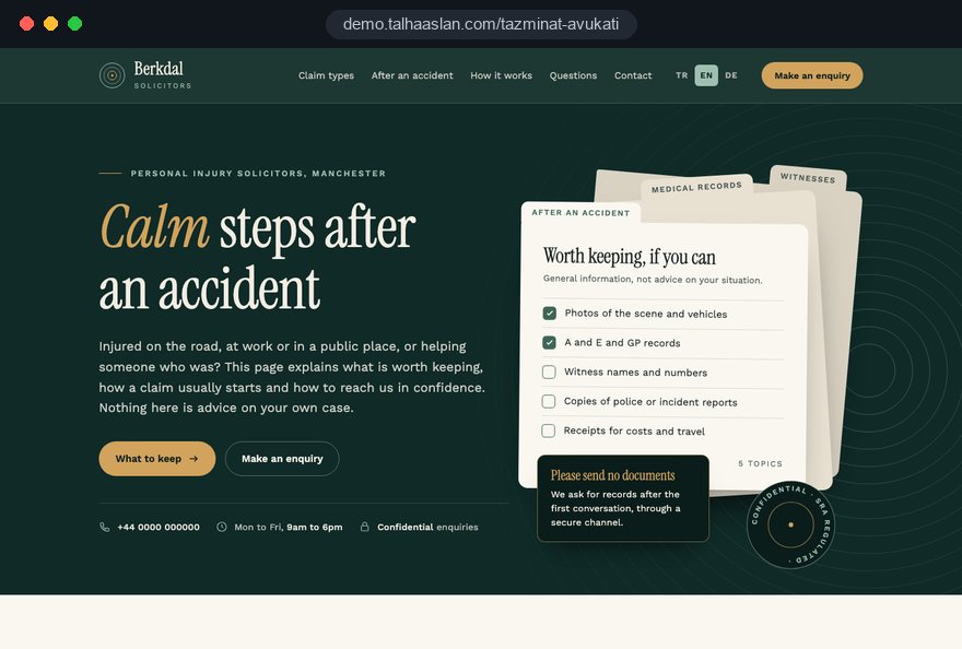
Open the live demoA demo design we built for a fictional brand
In short
A personal injury lawyer website explains which accident and injury claims a firm handles, how a claim is funded and what happens next, and lets an injured person get in touch without sending medical records. In England and Wales, the SRA Code requires publicity to be accurate and not misleading, section 56 of LASPO 2012 bans referral fees in personal injury work, and success fees under conditional fee agreements are capped in personal injury claims.
Talha Aslan and teamLast updated:
Why it needs its own approach
Personal injury is one of the most heavily marketed areas of law and one of the most tightly regulated. Sites built for volume often run into the rules.
The phrase sits in every heading, but the site never explains the success fee, what may come out of damages or what happens if the claim fails. People learn it at the first meeting, and trust drops.
Banners about maximum compensation, quick payouts or typical settlement sums set expectations no lawyer can meet before seeing the case. The SRA Code requires all publicity to be accurate and not misleading, including information about charges.
Small text, long forms and no visible phone button stop an injured person or a relative from reaching you at the moment they decide to call.
Upload fields for medical reports, injury photos and police documents gather sensitive health data from people who are not yet clients. Confidentiality and data protection both argue for asking only what you need to reply.
Lead sellers and comparison sites feed many injury practices. Section 56 of LASPO 2012 makes it a breach for a regulated person to pay or be paid for referrals of personal injury business, so a site built around bought leads is a risk, not a shortcut.
Dozens of near identical pages for every town and accident type rarely answer anyone's question. They add little for readers and dilute the pages that really matter.
Sources: SRA Code of Conduct for Solicitors, RELs and RFLs, paragraphs 8.8 and 8.9 · Legal Aid, Sentencing and Punishment of Offenders Act 2012, section 56
Our approach
We plan a personal injury site around the three questions an injured person asks first: can this firm help with my kind of accident, what will it cost me, and how do I speak to someone safely. Claim type pages answer the first, a funding page the second, and a short form with click to call the third.
This differs from our law firm website page, which centres on lawyer profiles and practice areas. Here the focus is a stressful first contact and the advertising traps typical of injury work. Firms acting for people injured while visiting from abroad can add language versions.
Design, development and content sit in one team: Talha Aslan sets the strategy and our team handles delivery. We do not write legal advice; we prepare the structure and plain wording, and your lawyers write or approve every statement before it goes live.
Home
Claim type pages carry no payout figures or promises; all of them lead into the same form that asks for no medical records.
The right setup
The foundation stays the same; what changes is which accident type and which caller reach the site most often.
Road traffic
Callers are often relatives, and their first question is how a claim gets started.
Workplace
The caller may still work for the employer, so discretion matters from the first click.
Mixed practice
Injury work sits next to the firm's other areas with equal weight and the same tone.
Built for injury work
We plan these points first, because they decide whether an injured person calls and whether the site stays within the rules.
For each type: who it usually concerns, what the first conversation covers and common questions. No average payouts and no time promises; your lawyers write or approve the wording.
If you offer conditional fee agreements, the page explains the success fee and what may be deducted from damages. Under the Conditional Fee Agreements Order 2013, in personal injury claims at first instance the success fee is capped at 25% of general damages for pain, suffering and loss of amenity and damages for past financial loss.
The form asks for a name, a phone number, the type of accident and a convenient time to call back. There is no upload field; your firm decides when and how documents are collected securely.
Large text, strong contrast, a fixed call button and a single column form. Pages stay light so they load quickly on a weak mobile signal, and accessibility is checked before launch.
No partner logos, paid lead widgets or claim calculators that pass details to third parties. Section 56 of LASPO bans paying or receiving referral fees in personal injury work, and the site should not suggest such arrangements.
Under the SRA Transparency Rules, the SRA number and digital badge are displayed prominently and the complaints procedure is published, including how and when a complaint can go to the Legal Ombudsman and the SRA. We plan these in from the start.
Sources: The Conditional Fee Agreements Order 2013, articles 4 and 5 · SRA Transparency Rules
Comparison
| Topic | Volume driven claims site | Site built around the injured person |
|---|---|---|
| Claim pages | Town and accident pages with near identical text | One page per claim type that explains the process |
| Results | Payout figures and maximum compensation banners | No sums, time promises or guaranteed outcomes |
| Funding | A no win no fee slogan only | Success fee, deductions and what happens if a claim fails |
| First contact | Uploads for medical reports and photos | Accident type and call back time, no records |
| Leads | Bought leads and partner referral widgets | Only direct enquiries to the firm |
| Mobile use | Long pages designed for a desktop | Fixed call button and a short single column form |
Quick check
Must haves: does your site have them?
0 of 6 in place Tick the boxes to see where your site stands.
Added as needed
We choose which of these you need together during the scoping call.
Tell us which accident types you handle, how many lawyers you have and who usually calls you; we will come back with a page structure and a written quote.
Process
We define your business, your audience and the site’s one-sentence job: who it sells what to, through which action. Scope and timeline are written from that answer.
The home page and key templates come to you as designs first; no code is written before your approval. We do not like surprises, and we do not cause them.
The approved design becomes fast, secure, maintainable code. You follow progress in the CRM and see every page in a staging environment before launch.
The site goes live with analytics, Search Console and conversion tracking connected; panel training is given, first-year hosting and maintenance included.
Search and speed foundations
People search for a type of accident claim, often with a town, or look up a recommended firm by name. One useful page per claim type, the contact page and the Google Business Profile support each other; we do not mass produce town pages.
Firm name, address, phone and lawyers are marked up for search engines; nothing that is not visible on the page, and no unverifiable claim, goes into the markup.
Hospital wards and roadsides often have poor reception. Pages stay light, images are compressed and Core Web Vitals are measured before launch.
Calls and form submissions are tracked with consent, so you can see which page brings enquiries. Accident type, names and health details never reach analytics.
Free tools
Test what an injured person notices first on a phone: connection security, mobile usability, readability and contrast. The tools are free and need no sign up.
Security
Check an SSL certificate's validity, expiry date, issuer, hostname match, certificate chain and TLS versions in seconds.
Tech SEO
Test whether a page works well on phones: viewport, font size, tap targets, a mobile screenshot and Core Web Vitals.
Content
Readability score with Flesch (EN), Ateşman (TR) and Flesch-Amstad (DE).
Accessibility
Calculate the contrast ratio of two colors under WCAG 2.2, see AA and AAA results and get accessible color suggestions.
Why do your emails land in spam? Check a domain's SPF, DKIM and DMARC records, find the errors and get a corrected record to copy.
Tech SEO
Find broken links, redirects and broken images on any page, with status code, anchor text and target URL.
How we work
We do not yet have a live client project in this field. To show the approach, we built a live demo site; it is an example, not a client. Our work in other sectors is on the references page.
Live demo
For this field we built a one page demo site for a fictional brand, made only to show our approach. You can explore the design, the copy structure and the mobile view live in three languages.
Open the live demoBefore design starts, we go through the conduct rules of your regulator or bar together and plan the pages from them.
We prepare the structure and plain language; your lawyers write or approve every legal statement, and nothing goes live without your sign off.
The form collects no documents, and who keeps enquiries and for how long is agreed in writing at the start.
Before launch, we check every page for payout figures, time promises, outcome claims and specialist labels.
Related pages
Industries
For a general law firm site built around lawyer profiles and practice areas.
Industries
For the other side of a claim: websites for insurance agencies.
Solutions
Language versions for firms acting for injured visitors from abroad.
 How to Build a Law Firm Website: A Compliance First Guide for LawyersRead article
 How to Build a GDPR and KVKK Compliant Website: A Business GuideRead article
 Website Data Security for Business Sites: Encryption and Secure Data Handling GuideRead article
 What Is Mobile First Design? How Mobile First Affects Your SEO RankingsRead article
FAQ
If your question is not here, write to us; we will send you an answer and a written quote.
Next step
In a free 15-minute call, in English, we will go through the claims you handle, your team and who usually contacts you, then send a written scope and quote.
In-depth guide
A personal injury website is read at a bad moment. The visitor has just been hurt, or someone close to them has, and they are usually on a phone, tired and worried about money. At the same time, personal injury is one of the most heavily marketed areas of legal work, and the rules on publicity, referral fees and funding are stricter here than almost anywhere else in practice.
This guide sets out the decisions we, Talha Aslan and team, make in order when we plan a site for a firm handling accident claims. We use the rules for solicitors in England and Wales as the main reference because they are detailed and public, and we flag where other markets differ. We prepare structure and plain wording; your lawyers write or approve every legal statement, and compliance calls stay with your firm.
The first planning question is not design but jurisdiction: which regulator's rules will every page be measured against. A personal injury site for an SRA regulated firm, one for a US practice and one for a Turkish firm with English pages need different content, even if they look alike.
We write the applicable rules into a one page brief before any wireframe exists. Each later decision, from page names to the enquiry form, is checked against that brief, and anything uncertain goes on a list for your compliance lead. This sounds slow, but it prevents the most expensive kind of rework: rebuilding a finished site because a core section was never allowed.
No win no fee is the phrase injured people search for, and it is also where personal injury websites most often mislead by omission. Under a conditional fee agreement the client may still pay a success fee if the claim wins, and the site has to say so in plain terms rather than leave it to the first meeting.
The verified limits are useful because they are concrete. Under the Conditional Fee Agreements Order 2013, in personal injury proceedings at first instance the success fee cannot exceed 25% of general damages for pain, suffering and loss of amenity and damages for past financial loss. Under the Damages Based Agreements Regulations 2013, the payment in a personal injury claim at first instance is capped at 25% of the same combined sums, including VAT.
On the website, that turns into a few rules for wording:
A dedicated funding page does more for trust than any slogan, because it answers the question an injured person is too embarrassed to ask on the phone. It should be reachable from every claim type page and written so that a relative reading on a small screen can follow it.
We build the page in this order:
Two details matter more than they seem. First, a last reviewed date at the foot of the page, because funding rules and your own terms change. Second, no worked examples with sums: an example that shows a specific deduction from a specific award reads as a forecast, even when it is labelled as an illustration. Plain sentences about percentages and caps carry the same information without suggesting an outcome.
Each claim type page should tell a visitor whether your firm handles their kind of accident and what happens next; it should not tell them how much they will receive. Road traffic accidents, accidents at work, accidents in public places and fatal accident claims each deserve their own page because the person calling, and their first worry, differs.
A useful page follows the same frame every time:
What we leave out is equally deliberate: average payouts, injury value tables, "maximum compensation" banners and stock images of cash. The SRA Code's accuracy requirement covers implications as well as statements, and a figure on a page implies an outcome nobody can predict before seeing the medical evidence. Your lawyers write or approve the final text of every claim type page.
Proof is the hardest part of a personal injury site, because the usual proof, settlement figures, is the content most likely to mislead. We plan trust signals that a visitor can check rather than numbers they have to take on faith.
We also check images. A photograph of a crashed car or a hospital bed looks authentic but adds pressure rather than information. Real photographs of your lawyers and your office entrance, with names and admission details next to them, do more for a frightened visitor and carry no compliance risk.
The lead generation model that fills many injury practices is exactly what section 56 of LASPO 2012 targets. A regulated person is in breach if they pay for a referral of personal injury business, or are paid for referring it on; the section also covers being paid for arranging for another person to provide services to the client in that business.
In website terms, that rules out several familiar features:
Paragraph 5.2 of the SRA Code adds a practical point: where it appears to the SRA that you made or received a referral fee, the payment is treated as one unless you show otherwise. A clean website architecture, where every enquiry goes straight to the firm and nothing is shared with third parties, makes that easy to show. For the insurance side of the same accident, our insurance agency website page covers how agencies handle claim notifications on their own sites.
Paragraph 8.9 of the SRA Code says solicitors must not make unsolicited approaches to members of the public, other than current or former clients, to advertise legal services. A personal injury website therefore has to work as a place people choose to visit, not as the endpoint of outreach.
This affects features that agencies often bundle by default:
The same thinking applies offline, but the website is where it becomes visible to a regulator: every automated message the site sends is evidence of how the firm treats injured people. We list each automated message in the project brief, with its exact text and trigger, so your firm approves them before launch rather than discovering them later in a complaint.
For SRA regulated firms, some information is required by the Transparency Rules and should be designed in from the first wireframe. Authorised bodies must display their SRA number and the SRA's digital badge prominently on their website, and must publish their complaints procedure, including how and when a complaint can be made to the Legal Ombudsman and to the SRA.
We place these elements as follows:
Firms outside England and Wales have their own equivalents, from a German Impressum to the registration details a Turkish bar requires. The principle is the same: identity and regulatory details are visible without searching, consistent with letterhead and register entries, and checked again whenever a lawyer joins or leaves. A mismatch between the badge and the register is the kind of small error that makes a cautious visitor close the tab.
Most personal injury enquiries begin on a phone, often on a weak signal, so the first screen has one job: show who you are, which accidents you handle and a button that calls you. Everything else sits below that.
Our checks before launch:
Accessibility matters more than usual here. Visitors may have a hand injury, concussion or simply shaking hands after a crash, so tap targets, clear labels and keyboard support are practical needs, not extras. Our mobile friendly test shows how your current site behaves on a small screen in a few seconds.
The enquiry form on a personal injury site is often filled in by a relative, which means it can collect someone else's health information without anyone intending to. Health data is special category data under data protection law, and gathering it before anyone has spoken creates risk without benefit.
We design the form around that reality:
After the form, the routing matters as much as the fields. Notifications go to named people rather than a shared inbox, unconverted enquiries are deleted after a period your firm sets, and documents arrive later through a secure channel the firm chooses. Check that email sent from your domain is authenticated with our SPF, DKIM and DMARC checker, so replies to injured people do not land in spam.
People look for personal injury help in two ways: by claim type, often with a town name, and by the name of a firm someone recommended. A site that serves both has one strong page per claim type, a clear contact page and a Google Business Profile whose name matches your real firm name without added keywords.
What we avoid is the volume model: dozens of near identical pages for every town and accident type. They answer nobody's question, dilute the pages that matter and, for a Turkish firm, collide directly with the bar's ban on keywords and page addresses aimed at ranking. Our SEO service for legal clients works the other way round, from fewer and more useful pages.
For firms acting for people injured abroad, language versions are often more valuable than town pages:
The technical setup is described on our multilingual website page.
These mistakes rarely come from bad intent; they come from templates built for high volume claims marketing. Each line includes the better alternative.
You can check your current site against this list in an afternoon. If most marks fall on structure, such as town pages and lead feeds, a rebuild is usually less work than repair; if they fall on wording and forms, the existing site can often be fixed.
The right partner for a personal injury firm asks about your regulator, your funding agreements and your referral arrangements before talking about design. Questions worth asking any agency:
We do not yet have a published client project in this field, and we say so plainly; a live demo site for this field is linked on this page so you can see the approach. Our work in other sectors is on the references page. For a firm built around profiles and practice areas rather than injury work, our law firm website page is the closer match.
Fixed scope packages are listed in the web design pricing section. Tell us through the contact form which claim types you handle, how many lawyers you have and which languages you need, and we will send a page plan and a written quote; every legal statement stays with your firm to write or approve.
Start a Project
Thanks {name}, we've received your brief. We usually reply within the same day.
What happens next?